Tuesday, December 28, 2010

BAC Update 2

I hate that bank but I couldn't help it. I bought BAC at Thursday's close (the red candle in the chart three trading days ago) when the stock didn't break down below Wednesday's breakout. (I guess I was bored of inaction.)

The target is still $14.56, but I would settle for the 200-DMA ($14.39) if that happens within the next week or two. The stop is Thursday's low, slightly below $13.

It's hilarious to hear about CNBC pumping the stock market (as if the stock market is the economy), and one of the junk that they've been pumping is the financial sector, BAC included.

As I said in the previous post, the setups for the fins continue to look good. JPM and MS are breaking out of the range, GS may be forming an "ascending triangle" pattern, and C may be forming a handle on a cup that's been forming since April.

Monday, December 13, 2010

Double Bottom Pattern on Bank of America (BAC)

(UPDATE 12/21/2010)

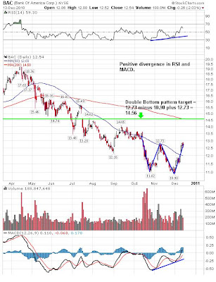
BAC had a breakout from the handle of the double-bottom pattern today, taking out the buy point (12.73) on a larger volume than yesterday. Target price $14.56. GL if you are trading.

-------------------------------------------------

Negative sentiment of November dissipated as soon as December hit (just like the head and shoulders pattern that everyone was watching was negated as soon as September hit).

Financial woes in Europe continue, and the US had the largest November monthly deficit on record. If you read the financial news, buying the stocks of financial institutions should be the last thing on your mind.

But guess what? They are the ones leading the market up. Here's Bank of America, whom many think may go Lehman pretty soon. Whatever their fundamental problem is (bad, very, very bad), the stock chart shows a clean double bottom pattern with the target price of $14.56, over 14% gain from the current price.


A buy point would be the middle of "W", which is $12.73. It could form a handle right about now, and if it does, the buy point would be still $12.73. RSI and MACD both show positive divergence.

If you don't worry about the fundamentals and don't worry about factors outside the control of the bank or of the US government (such as Ireland decides to default instead, or China's bubble suddenly bursts), it may be a quick trade if the breakout from the current level happens, with a very tight stop.

I have no intention of touching banking stocks and I certainly do not recommend any such stocks, but if you are interested in gambling on Wall Street banks, BAC seems to be one of the less extended. C is too extended, and GS doesn't look constructive. JPM and MS look range-bound, and they are both at the top end of the range. Do your DD.

Sunday, November 28, 2010

Dow at Fibonacci Resistance

Technically, a logical place to stop and turn back.

As the chart below shows, Dow Jones Industrial Average tried to bust through the 61.8% retracement from the March 2009 bottom back to the October 2007 market top, and failed.


Not all is lost. On the daily chart, it is sitting right on the 50-day simple moving average, which may act as a support. Personally, I don't like the way it's been trading for the past week - one big down day followed by one big up day, and then another big down day. That doesn't look like a bottom being formed; rather, it looks like a topping pattern.

It looks and feels the same - that the index is about to break down - as at the end of August. Back then, a big up day was followed by a big down day, and just about everyone was looking at the neckline of the big head and shoulders pattern. And it didn't happen. September was a big up month as the US dollar cratered.

Ben's printing (QE2) hasn't resulted in an up-market in November, contrary to what Ben said when he boldly embarked on the purchase. The only thing keeping the market from crashing (there are a plenty of reasons why Dow should be tanking 1,000 points every single day) may be the hope that Ben and the Inkjets at the Federal Reserve will deliver on their word, that QE2 will cause the stock market to go up, making everyone feel rich.

I'm watching the US dollar, which has broken out of the pattern which could be called a bullish falling wedge. The breakout coincided with the worsening of Ireland's debt problem, which is supposed to be resolved now by the $113 billion bailout.

US dollar down, stock market up. That pattern persists.

Tuesday, November 23, 2010

Louise Yamada Cautions Further Weakness

A week ago I posted that Dow was on the blink. A week later, it is still on the blink, actually almost at the same level; the index had a huge rebound 2 days after I posted (to be expected, LOL), then went nowhere for two trading days, and a big down day with good volume.

Louise Yamada, one of the best technical analysts out there, thinks the next logical support will be the August high, around 10,700 for Dow (like I said....), and that would be still considered consolidation.

However, she sounds caution that it may not hold there. The reason? Because the market failed to break out of the April high. She considers that to be more important than the lack of daily volume which many analysts (including Art Cashin) have pointed out as a bearish sign.

For more, go to Kingworld News.

(h/t erikbacardi)

Tuesday, November 16, 2010

Dow on the Blink

I am very well aware that the last post's title was "Dow to 16,000". That was right after Ben and the Inkjets announced $600 billion QE2. Things haven't changed much in the US, I don't think, but ever since it has been the "sell whatever the news is" market. The debt crisis in Ireland hasn't helped either.

Here's a 1-year daily chart of Dow. It's a simple chart with just the Bollinger band, and intermediate/long-term indicators. It stopped today at the lower Bollinger band. If this doesn't give support, the next suppot level looks like 10,700 area. The intermediate/long indicators - CCI set at 133, slow stochastics set at 89 - are signaling a potential turning point. CCI is right now 100.11. If it breaks below 100, the bull run since September may be over. The same thing with slow stochastics. It is just about to cross below 80.


I am not putting any new trade, long or short. It does not feel safe here. Instead of TA, I have been paying more attention to what's happening politically in the US and Europe.

(How can a stock market of a country where you have to allow a total stranger put his/her hands inside your pants so that you can get on an airplane go up? That's what I have been wondering since the beginning of November, and the answer so far is no it cannot.)

Thursday, November 4, 2010

Dow to 16,000! (Thank Ben)

As the deranged central bankers running amok with $110 billion per month monetization (that's what it is, even though it is done through the primary dealers - who happen to own the Fed), the sky seems to be the limit for the stock market and the commodities market.

Buy anything, it will be good for you, says the bankers.

So, let's take a look at how high Dow Jones Industrial Average can go, TA-wise. I know, I know, what's TA in the age of permanent meddling by the Fed? Well, algos used at the NY Fed may be programmed to think and act like a human trader. Their time-span is in seconds for their "long-term" holdings, that's all..

This is 5-year monthly chart of Dow. See how it is fashioned like a cup and handle? A rather pointed cup but never mind that. The index is just breaking out of the handle high. From the pattern, the target price would be:

Depth of the cup + handle high. And that computes to: 16,046.


Sometime in 2012 maybe. Ben should do QE3, 4, 5, 6, 7... to make sure it gets there. But good luck when you have to answer Ron Paul in the Finance subcommittee, Ben. You can't laugh at him like you did before, because he will be the chairman of the subcommittee...

Again, this is not an investment advice. Just for your entertainment. Laugh and be merry. A cup of Starbucks coffee may cost you $20 soon, but your 401K will increase in price (until the government decides to seize it from you by stuffing special Treasury retirement bonds...) GLTA.

Thursday, October 21, 2010

Goldman Sachs Says "Front-Run the Fed POMO"

to make money in the stock market. Buy stocks before the Fed's open market operation, and sell into the rally induced by the operation. Rinse and repeat. Buy anything.

The market is in a suspense mode, going nowhere speculating and re-speculating the Federal Reserve's move. Today's sell-off came after the reverse-repo operation was done (that sucked out liquidity from the market). Everything depends on what the Fed does, what the Fed talking heads say.

What's the point of TA? Not much these days, other than to out-guess algo bots..

Here's from Zero Hedge today:

After a few months of breaking down what the simplest trade in the world is, that would be frontrunning the Fed for the cheap seats, Zero Hedge is happy to advise our readers that finally Goldman Sachs itself has capitulated and is now indirectly telling its clients to frontrun Ben Bernanke via POMO. No complicated value investor nonsense, no pair trades, no cap structure arbitrage, no hedging, no levered beta plays. Buy ahead of POMO. Sell. Rinse. Repeat.
On the interplay between the FED and STOCKS: Since Sept 1 – when QE was becoming a mainstream focus – if you only owned S&P on days when the Fed conducted Open Market Operations (in US Treasuries), your cumulative return is over 11%. in addition, 6 of the 7 times when S&P rallied 1% or more, OMO was conducted that day. this compares to a YTD return of 5.8%. the point: you would have outperformed the market 2x by being long on just the 16 days when – this is the important part – you knew in advance that OMO was to be conducted. The market's performance on the 19 non-OMO days: +70bps.

And there you have it - the top in frontrunning the Federal Reserve is now in.

The most recent Fed POMO calendar is linked (there is one tomorrow). Frontrun away.

Oh, and Ben, your criminal organization will one day pay for making a complete manipulated travesty out of capital markets.

I do have one chart to show you. CORN. The bull flag may break out. But it all depends on the US dollar, which seems to be finding (or trying to find) a temporary bottom. I'm not in the stock, but thinking about it, looking at the USD. G20 this weekend, a currency war brewing.

Good luck trading. No matter what Ben and the inkjets do, it could all collapse in a very short time like October 2008, and a trigger in such a case is often political... Just saying...

Wednesday, October 6, 2010

Coal Trade the Day After

If you picked up the coal stocks that I mentioned in the last post, good for you. I slept late and missed the action :-(

Early birds do get worms and more.

If you have PCX, congrats on the 10% gain in one trading day.

Including PCX, if you look at the weekly charts, it is not too late to go long, AS LONG AS the general market trend is up.

Tuesday, October 5, 2010

Looking at Coal Stocks for Next Trade

Congrats for those who bought SIRI (wish I had it), congrats for those who bought CENX and still have the shares not taken away in a mini flash crash (like mine). I'm moving on, and I'm thinking coal.

Why? Because it looks like one of the last remaining commodities that haven't broken out. The other one is crude oil, but at least I've caught the last week's big move with UCO calls (sold half today).

I'm looking at the charts for:

MEE (Massey Energy)
ANR (Alpha Natural Resources)
PCX (Patriot Coal)
BTU (Peabody)
ACI (Arch Coal)

BTU and ACI look strong, and may be doing the triple top breakout on the 3-year weekly chart. MEE, ANR, PCX all look alike, and they are still basing.

BUCY (Bucyrus) looks ready for double top breakout, too, on the weekly. It actually looks like a very deep cup and handle, with the handle part itself is a cup. Its competitor, JOYG (Joy Global), has already broke out.

Fundamental reason for coal? The world may be entering "global cooling", not "warming". We may need more carbon in the air to keep the planet warm...

I am also looking at uranium companies, for the same reason. In severe cold, wind and solar just don't cut it. USU (Usec) seems to be forming a symmetrical triangle after wild moves.

As usual, do your own DD.

Friday, September 24, 2010

So, Harvest Moon Right After Equinox Did the Trick!

and the Harvest Moon was accompanied by two majestic planets - Jupiter and Uranus. (For more on those astrological portents, read my other blog from Wednesday.)

Congrats to longs, and congrats to anyone holding CENX without trailing stop. Those crooks aka market makers took away my shares when they so artificially slammed the stock yesterday at the open and take out my CENX at the lowest of the day.

Hats off to Takeit on Yahoo board who predicted the gap and run for Friday.

My own tell was alas, sadly, again, Q-man at Tickerville. He was negative on Thursday.

Now where do we stand?

Here's S&P500 daily. Do I see a reverse head and shoulders? Yes I've been seeing that. It looks like a breakout from that pattern to me. The target then is above April high. In between, I think there's a fair chance of the index to at least go as high as 50% retracement (1174, May high after the flash crash) from the neckline (1130) to April high (1219).


If it can retrace all the way and then more and hit the pattern target, then the bigger picture does indicate it could go above 1300. The last time the index was above 1300 was August 2008, right before the cascading crash.

Oh wait, didn't I say that before? Yes I did, but that was right before the flash crash... Oh well, scratch that. Maybe this post on fractal patterns is more like it... Like I say, this is an entertainment, not an advice, ever.

Who knows.. With the Federal Reserve intent on convincing the rest of us that the stock market IS the economy by pumping so much money via QELite (aka POMO) almost every other day...

Monday, September 20, 2010

CENX for Aluminum Shortage Play?

(Well RIMM was a dud...)

I bought a small position on CENX today, after seeing it was breaking out on a larger volume from a nice consolidation pattern that also has a MACD positive divergence.


Then I just read this news at Kitco.com:

"(Kitco News) -Harbor Intelligence looks for three-months aluminum to hit $2,400 per metric ton on the London Metal Exchange in the weeks ahead. Harbor cites expectations that Chinese output will fall, given two years of “negative economics for producers” and pressure on smelters to cut production to meet energy-saving and environmental goals. The most recent data implies that China lost 6%, or a net 982,752 metric tons, of annualized aluminum output in July and August. Meanwhile, demand for semi-aluminum products (autos, construction, etc., which are the main customers of primary output) in China is rising, with a monthly gain of 14% in August, which amounts to annualized output of 2.9 million tons, Harbor says. Ultimately, demand for primary and scrap aluminum will accelerate due to a pick-up in final demand and re-stocking needs for semi-aluminum producers. “Our models show increasing risks of a strong rally in aluminum prices in the final quarter of this year,” Harbor says. A rise toward $2,400 in the fourth quarter will also exert upward pressure on regional aluminum premiums around the world, Harbor adds."

My buy point was $11.62. Trailing stop at 6% loss, first target is a gap-fill above $13.

Thursday, September 16, 2010

Shoulda, Coulda: RIMM

The last RIMM post I had here was late July, for it to break down from $55. Well that happened.

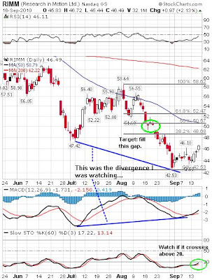
I've been watching RIMM since for several weeks, and I've kept saying to myself, "positive divergence, positive divergence..." in MACD. Despite the analysis of the stock that I read on fundamentals, which are downright dismal, I saw this divergence and I thought "You know what, the stock may pop any time, surprising everyone." And the first target would be $50, I thought to myself just yesterday. Yesterday's close was $45.52.

Well well. It may happen, after all. Research In Motion reported its earnings AH today and it beat estimates. The share price went up 4.54% in after hour trading, to $48.60.

Here's the divergence that I saw and didn't act on it. Oh well. C'est la vie. (Oh BTW, anyone who acted on SIRI, congrats! It took a while but now it seems to be on its way further up.)


If the general market stays up, it may not be too late to buy in. Watch 60-period slow stochastics to see if it crosses above 20 (buy signal). Do your own DD, this post is nothing but entertainment.

(And why don't I listen to my own advice? The whole point of starting this blog was to get it out there so that I would actually see what I think and follow my own advice once in a while...)

Wednesday, September 1, 2010

SIRI May Be Getting Ready to Break Out

Sirius XM Radio Inc. (SIRI) may be ready to break out, if the general market breaks out higher. I don't know anything about the company or its fundamentals; from what I hear it is a POS to say it mildly.

But the daily chart is showing a symmetrical triangle pattern, which is a continuation pattern, and the previous trend was up, albeit erratic. A symmetrical triangle pattern seems to break in the direction of the general market. Resistance at the upper downward trendline, at about $1. Target would be the breakout point plus the height of the triangle = $1.42.


What I like about this recent pattern is that the erratic move of this stock since late last year has calmed down enough to form a constructive pattern. That usually precedes a big move.

Today Nasdaq had a follow-through day with a huge gain on a larger volume. Dow and S&P500, though the gain was significant, didn't have enough volume to qualify as a follow-through day. Maybe after the severe beating that the market took, bit stocks like SIRI may float to the surface rapidly. Just maybe.

But don't take my word for it. This is not an advice or recommendation. Do your own DD.

Thursday, August 26, 2010

Silver Breaking Out: SLV

Whatever got into the poor man's gold (that's silver) today (8/25/2010), it pretty much had a TA textbook breakout from a pennant or triangle formation.

Here's a 6 month daily chart of SLV, an ETF that tracks silver (and is supposed to be backed by physical silver, though no one with a working brain believe it). This breakout would put the target price of SLV at $20.84.


In a 3-year weekly chart, SLV seems to have formed a cup and handle, and the handle is shaped as a pennant. The target based on that formation is over $30.


I bought SLV when it was slightly below $12 in April 2009 and I have kept it ever since. Unlike my gold ETF (DGP, also a long-term holding), SLV has never dipped below my buy point. I have no intention of selling either of them anytime soon.

I've read analyses by gold/silver bugs saying silver will go much higher percentage-wise than gold. I've seen a target price of $100. Well, if J.P.Morgan Chase is forced to cover its silver naked short positions, that should do the trick...

Tuesday, August 24, 2010

Third Confirmation of Hindenburg Omen Today

or 4th occurrence in 9 trading days (August 12, 19, 20, and 24). For more, see Zero Hedge.

The stock market seems and feels under heavy stress every day, and the struggle gave way today near the close. This is not good for the remaining longs.

Remember the "Cardinal Climax" that was supposed to happen around August 1? Maybe it was delayed and is happening right now...

Friday, August 20, 2010

Second Confirmation of Hindenburg Omen

says Zero Hedge, noting also the Iranian nuclear reactor event on Saturday:

"Longs may be forgiven if they are sweating their long positions over the weekend: not only did we just have a second, and far more solid Hindenburg Omen confirmation today, with 82 new highs, and 94 new lows, but the Saturday is the day when Iran launches its nuclear reactor, and everyone will be very jumpy regarding any piece of news out of the middle east. As for the H.O., the more validations we receive, the greater the confusion in the market, and the greater the possibility for a melt down (or up, as the case may be now that the market is unlike what it has ever been in the past). Furthermore, with implied correlation at record levels (JCJ at around 78), any potential crash will be like never before, as virtually all stocks now go up or down as one, more so than ever before. And should the HFT STOP command take place, the future should be very interesting indeed (at least for the primary dealers, and the Atari consoles which are unable to VWAP dump their holdings in the nano second before stuff goes bidless)."

Be very careful out there. Back to back Hindenburg Omen (see the previous post for the first confirmation, which was yesterday), I bet it's the first...

On the other hand, you could argue that this stock market is so broken with HTF algo-bot infestation, regulatory incompetence (SEC and CFTC), regulatory power-grab (FinReg bill aka Dodd-Frank bill aka Donk bill) that a Hindenburg Omen now occurs regularly, signaling absolutely nothing.

Thursday, August 19, 2010

Uh Oh... Hindenburg Omen Confirmed

From Zero Hedge today:

"Today we got our first Hindenburg Omen confirmation. The number of new highs was 136, and new lows was at 69 (per the traditional WSJ source). Granted this particular criteria set was a little weak as the 69 is precisely on the borderline for confirmation (the 2.2%), and the new highs number was not more than double the new lows (although it was close). Less gating were the McClellan oscillator which was negative at -83.6, and the 10 week MVA, which rose, which were the two remaining conditions. The first omen was spotted on August 12 - a week later the H.O has been confirmed. The more confirmations, the scarier it gets from a technical perspective, not to mention the conversion into a self-fulfilling prophecy (like every other technical indicator)."

As a reminder, the criteria for the Hindenburg Omen is in my August 13 post, one day after the first H.O.

Sunday, August 15, 2010

German Bourse Looks Much Better than US Counterparts

Amid an incredible amount of "doom and gloom" (most recently the Hindenburg Omen), I went looking for a constructive (if not downright cheerful) chart. I'm a contrarian in nature, and when just about everyone (not just people like Gerald Celente and Peter Schiff) is doomy and gloomy, it's either everyone is right for once or everyone is wrong again.

Anyway, I found a constructive chart, and it is German DAX Composite.

The 3-year DAX weekly chart shows the index is still above the 40-MA, unlike the US indices which struggled to fully regain that line and ended the week below. The correction that started in late April looks more like a consolidation, forming an ascending triangle pattern above the 40-MA. If the ascending triangle pattern plays out, the target would be 7027. That's about the target of the point and figure chart also. The index ended the week at 6110.


Germany's economy grew by 2.2% in the second quarter, the fastest in 20 years since the reunification. It grew by making things that people around the world want to buy, even at a premium. It grew DESPITE the government stimulus, which many in Germany acknowledge was misspent and probably unnecessary.

A stark contrast to the US.

Friday, August 13, 2010

Hindenburg Omen on August 12, 2010

Just so you know.

It doesn't mean we will have a market crash, but they say all major market crashes were preceded by the Hindenburg Omen.

The Hindenburg Omen criteria from Wikipedia:

The traditional definition of a Hindenburg Omen has five criteria:

  1. That the daily number of NYSE new 52 Week Highs and the daily number of new 52 Week Lows must both be greater than 2.2 percent of total NYSE issues traded that day.
  2. That the smaller of these numbers is greater than or equal to 69 (68.772 is 2.2% of 3126). This is not a rule but more like a checksum. This condition is a function of the 2.2% of the total issues.
  3. That the NYSE 10 Week moving average is rising.
  4. That the McClellan Oscillator is negative on that same day.
  5. That new 52 Week Highs cannot be more than twice the new 52 Week Lows (however it is fine for new 52 Week Lows to be more than double new 52 Week Highs). This condition is absolutely mandatory.
These measures are calculated each evening using Wall Street Journal figures for consistency. The occurrence of all five criteria on one day is often referred to as an unconfirmed Hindenburg Omen.

A confirmed Hindenburg Omen occurs if a second (or more) Hindenburg Omen signals occur during a 36-day period from the first signal.

The Hindenburg Omen mechanism can be applied to other stock exchanges like Paris, Berlin, Tokyo or Sydney but the criteria for it must overall be the same.

Monday, August 9, 2010

Go with the Index (Bearish) or Individual Stocks (Bullish)?

A bit of a conundrum.

While I continue to wait for FAS to break out (FOMC meeting just in time...), I don't know which way the market may break. On the major indices like Dow and S&P500, I see a rising wedge pattern with declining volume (=bearish) coupled with negative divergence on MACD. But if I look at individual stocks, I see a reverse head and shoulders pattern (=bullish), FAS being one of them.

Here's a take from Matthew Frailey at Breakpoint Trades (from their free newsletter).

Thursday, August 5, 2010

Bull Flag on FAS?

Is it finally breaking out?


(Of course you would have been better off trading JPM or GS for the last month...or even MS.)

Monday, August 2, 2010

CCJ Gapped Up, So Did GLW

A gap up this morning is taking Cameco (CCJ) half way to 50% Fib. And another materials stock that's been on my watch list for eternity is breaking out, too.

Corning (GLW). Like CCJ, I've been watching this for a company-specific, fundamental reason and not TA reason. Yesterday I read about how Corning's super-strong glass from half a century ago was finally finding profitable applications in electronics. I went to look at the chart, and what I saw was a rather sloppy consolidation for the past two weeks or so. I thought it was too sloppy for a decent breakout, but I liked the news of this super-strong glass named Gorilla. Just see the chart today. A huge gap up (up 5%). What do I know...


Materials sector seems particularly strong. Another one that's gapped up today is Freeport-McMoran (FCX). FCX has broken out from a better formed flat-top consolidation (than GLW). Congrats to those who are in these stocks. I wish I were.

Sunday, August 1, 2010

Second Bull Flag on CCJ

Focusing too much on the major indices is not a very smart thing to do if you simply want a good trade. See the trees instead of the forest, in other words. Since algo bots latch on to the indices and index ETFs and a few beta big caps on Nasdaq, some less-known individual stocks may be still relatively free of bots.

Here's one example. Cameco (CCJ) has been on my watch list for very long time. I invested in the stock once, from . I kept watching mainly for macro and fundamental reasons (Cameco is a uranium miner). Last I looked at the chart was more than a year ago, and the stock hasn't gone anywhere. It is actually back to where it was a year ago.

But if you just look at the short-term, it would have been a good enough trade.

This is CCJ's 9-month daily chart. It seems to be forming a second bull flag after breaking out of the first one. There is a positive divergence in MACD and RSI. Slow (very slow at 89) stochastics has already signaled a buy, when it crossed 20, and when it crossed 50. 13-EMA and 34-EMA have also crossed back, signaling a significant trend change.


The stock just passed 38.2% Fibonacci retracement from the July low to the January high. It could go to 50%. Between 50% and 61.8% there seems to be a lot of overhead resistance. If you had bought the stock when the slow stochastics crossed 20, you might be sitting now with 20% gain in a month. Not bad in a volatile market.

Friday, July 30, 2010

Well, Hello Fractals.... Dow 3-Year Chart Now and Then (2008, 2009)

So the 2nd quarter GDP comes in lower than expected, but the obligatory dive of the stock market at the open was quickly eradicated. Dow Jones Industrial Average is down only about 10 points, instead of 100 points. For now, at least (9:30 AM PST).

Nothing to trade here, so I started my game of pattern recognition in the 3-year Dow daily chart. And I'm seeing something interesting. I'm not claiming it definitely, but I'm just sharing.

I see a pattern from October 2008 to June 2009 being repeated, albeit on a smaller scale and shorter time frame: diminution.


We know what happened after April 2009. It seems like QE2 in some form is all but guaranteed. Are we going to have another melt-up on low volume, going into the November election?

But you may also notice that the current pattern looks very similar to the pattern right after the market top, from December 2007 to April 2008. We know what happened after that. The stock market went up in April and May, making TA people giddy with the idea that the chart is forming a big "cup and handle" pattern and that the upside would be so great when that pattern breaks to the upside. And then June came, and it was all downhill from there...


So, take your pick. Or don't pick at all and join people who have been yanking their money from the equity mutual funds.

The Cardinal Climax is coming. Just so you know.

Thursday, July 29, 2010

CBOE's Weeklys on ETFs and Stocks May Be Causing a Range-Bound Market Since June?

Just so you know, too. (I didn't know. H/T liveup)

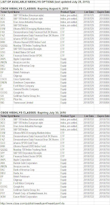
If you trade any of these ETFs and stocks, be aware that they have weekly options (Weeklys) traded on them on top of regular options, courtesy of CBOE (Chicago Board of Options Exchange), that expire every Friday. In case you're wondering why Apple (AAPL) gets hit back to $260 for several weeks, this may be your answer. CBOE has had Weeklys on the indices (S&P 500 and Dow, both American style and European style) since 2005, but the introduction of Weeklys on ETFs and select stocks is a recent event (since June 4, 2010).

ETFs:
SPY (since June 4, 2010)
QQQQ (since June 4, 2010)
DIA (since June 4, 2010)
IWM (since June 4, 2010)
EEM (since July 5, 2010)
USO (since July 5, 2010)
GLD (since July 5, 2010)
XLF (since July 5, 2010)

Stocks:
AAPL (Apple; since June 25, 2010)
BAC (Bank of America; since June 25, 2010)
BP (BP; since June 25, 2010)
C (Citigroup; since June 25, 2010)
F (Ford; since July 5, 2010)
GOOG (Google; since July 5, 2010)

What's more, the individual stocks that will have Weeklys on them seem to vary from week to week. Here's the latest indices, ETFs, and stocks that have Weeklys (table downloaded from CBOE):

(Click on the chart for a better view. If the image doesn't load fast enough, go here and download: http://www.cboe.com/publish/weelkysmf/weeklysmf.xls)

Note to FAS/FAZ traders: They've been range-bound for a reason...

Tuesday, July 27, 2010

Amazon Runs Out of Kindles

(Update 7/28/2010) So RIMM has popped on the news of iPhone killer. I'm not impressed with the move, at least not yet. The stock is yet to take out yesterday's high, which is $55.65. AMZN continues to languish, going nowhere.

-------------------------------

so reports Barron's Tech Trader Daily by Eric Savitz on July 27, 2010. Maybe that's why the stock had a miraculous reversal the day after the earning announcement:

(Quote)
Amazon.com (AMZN) has temporarily run out of Kindles.

Here’s what it says if you attempt to buy the e-Book reader on the company’s Web site:

“Temporarily out of stock. Order now and we’ll deliver when available. We’ll e-mail you with an estimated delivery date as soon as we have more information. Your account will only be charged when we ship the item.”

And what do you see when you go to the Amazon home page? Why, a promo for the extra-big Kindle DX!

As SlashGear notes, the sudden Kindle shortage could mean there has been a surge in demand - or it could mean a next-gen Kindle is on the way.
(Unquote)


That sudden reversal after the earning report has kept my AMZN puts worthless, but I still don't think much of the AMZN chart. Ever since the July top of $124.88 it's on the decline, underperforming the index (Nasdaq). You could say it is resilient, refusing to sell off. But it looks to me like it wants to sell off at any time now. (Of course I'm biased, I have AMZN puts.)

This stock and another Nasdaq beta Research in Motion (RIMM) look to me to be ready to dump. But then the Kindle rumor may be true, and RIMM just announced the iPhone "killer". They may turn on the dime.

Monday, July 26, 2010

AAPL's Peculiar Candlestick Pattern

(UPDATE 7/27/10) So it has popped, for now. Still over 1 hour left in trading. It is yet to take out the Wednesday high of $265.15 to be a textbook "Rising Three Method". The market is iffy, almost scared, after bad news on consumer confidence. Maybe I'll book my gain on August $280 calls...

----------------------------------------

Apple (AAPL) is forming an interesting candlestick pattern. I think it is either "Falling Three Method" or "Rising Three Method". I know I know they are total opposite, but I can't decide. So I let you see the chart.

Here's AAPL's 5-month daily chart. Since late April, the stock hasn't gone anywhere. Except for the flash crash on May 6, it has been range-bound. That itself is interesting, as this is one of the most favorite stocks of algo bots - big cap, high volume, high beta.


Here's the explanation of "Falling Three Method" from Stockcharts.com's Chart School Candlestick Pattern Dictionary:

A bearish continuation pattern. A long black body is followed by three small body days, each fully contained within the range of the high and low of the first day. The fifth day closes at a new low.

And "Rising Three Method":

A bullish continuation pattern in which a long white body is followed by three small body days, each fully contained within the range of the high and low of the first day. The fifth day closes at a new high.

The problem I have in determining the pattern is that the first day (Wednesday last week) was an up day but it was a gap up and sold off all day with the market. That doesn't feel bullish. But then, either pattern is a continuation pattern, and Tuesday was a huge up day.

So, cautiously, I am inclined to say it may be a "Rising Three Method" pattern, which means AAPL will go up tomorrow.

The stock futures are currently down. TA people are calling for a "consolidation" after three consecutive up days.

Well, the major indices registered a pattern called "Three White Soldiers", which is a bullish reversal pattern.

There was a sizeable volume (13,494) on AAPL August $280 call option (OE 36,273).

But the algo bots will do whatever they want to do, and the market can melt up or down on a thin summer volume. GLTA.

Tuesday, July 20, 2010

Large Caps on Turnaround Tuesday Look the Same

I am noticing today that stocks in totally different industries are exhibiting the same pattern on a daily chart. All very bullish candlestick formation (long white candle with hardly any wick), outperforming the general market.

Here are the 6-month daily charts for (from the top):

Las Vegas Sand (LVS)
Nucor (NUE)
Google (GOOG)
Freeport-McMoran (FCX)
J.P.Morgan Chase (JPM)


Don't know what to make of them at this point, other than my guess that algo-bots are simply working the ETFs and index futures so the heavily traded large caps all move the same way regardless of industry or fundamentals.

But even with today's move, these stocks, with the exception of LVS, are either still below 50-DMA or barely touching, or crossing 50-DMA but 200-DMA is still far away. It will take a lot more consolidation to repair the damage.

I personally like LVS (not on the 6-month chart but on the longer charts like 3-year). It was a steal at $1.30 or so in early 2009. It could go up the thin vertical wall that was October 2008 and reach $30. I just don't know when or how. (Casinos in Singapore and Macau, maybe.)

"Turnaround Tuesday" delivered a turnaround. Let's see if they (bots and bots operators) intend to hold it. The Fed chairman Ben S. Bernanke will be testifying in the Congress on Wednesday and Thursday. It could affect the stock market.

Tuesday, July 13, 2010

FAS - Mind the Gap

What a difference a week makes. Before the Independence Day the world was going to end in ruin. After, all the troubles are gone, at least from the US stock market. Fundamentals be damned, they don't change from week to week! What a bore!

As algo bots busily and dutifully working every microsecond of the day (and night) with the self-sameness, the humans that still inhabit the financial media outlets are doing their best to craft a narrative depending on the market direction of the day (sometimes of the hour), which has little to do with the reality on Main Street.

Since these bots like beta and leverage, IF they are planning to ramp up the market even further (until the Cardinal Climax hits), what better tool to hitch that ride than a triple-long ETF?

Here's a daily 9 month chart of FAS, triple-long financial ETF. The candlestick chart looks like a crap, full of gaps. Who in the sane mind wants to trade this? Or for that matter, any stock in this market?


Since the bots seems to like Fibonacci retracement numbers, I put in two sets of Fibs: one from May high to July low, the other from April high to July low. Today, it passed the 38.2% retracement to May high.

The biggest gaping gap exists between 50% and 61.8% retracement to April high. If this gap is filled, FAS will be about $31. It closed today at $23.57.

Now, is there any hint on the technical indicators that supports this bullish scenario? In fact there is. More than one. First is MACD. Notice the positive divergence developing. The second is ultra-slow stochastics (89), which just crossed above 20. If this stays above 20, it may be a buy signal.

The buy signal may be short-lived, though. J.P.Morgan Chase (JPM) will report its earnings during Thursday premarket, Bank of America (BAC) and Citigroup (C) during Friday premarket. In previous two earnings, JPM was sold hard despite beating the estimates.

If you got FAS, maybe it's safe to sell tomorrow and avoid the heart attack waiting for JPM to report on Thursday morning.

Oh I forgot. Fundamentals don't matter.

Algo bots have their own minds. As I wrote on the chart, if the chart is somehow plotted in 3D with data that is not represented in this 2D chart (data like each individual trade size and price done by the bots), it may become a beautiful Lorenz attractor and it may all make sense.

Sunday, July 4, 2010

S&P 500: Another Death Cross Imminent?

S&P 500 Index had a "death cross" (a very, very slight one) on the daily chart on Friday, where 50-day Simple Moving Average crosses below 200-day Simple Moving Average.

The index is about to have another death cross on the weekly chart. On the weekly chart, I look at two Exponential Moving Averages (13-EMA and 35-EMA) to see whether they are crossing, or 40-week Simple Moving Average to see if the index crosses below it.

Here's 3-year weekly chart of S&P. 13-EMA and 35-EMA is about to cross: less than 3 point. As you can see, 13-EMA crossing below 35-EMA in December 2007 was a pretty good indicator of a major directional change of the market. 13-EMA stayed below 35-EMA all the way till July 2009. 13-EMA/35-EMA pair does not call the market bottom, but rather it seems to indicate the safer point to go long, as in July 2009. Now 13-EMA may be crossing down again for the first time since December 2007.


I also use 40-week Simple Moving Average on weekly. As you can see, this one spotted the turn in the market a few weeks earlier than 13-EMA/35-EMA cross. Week before last, the index decidedly broke below 40-MA, and it couldn't regain that line this week.

End of the "bull market", as many pundits and analysts are saying?

I don't think so. I'm in the Peter Schiff's camp in thinking that this has been a Federal Reserve and government stimulus-induced counter-trend bull run within the bear market and the run is now ending. Elliott Wavers would say P3 has finally arrived. (The only problem is that they have been calling P3 at every downturn in the market since March 2009.)

Some technical indicators, which, along with 13-EMA/35-EMA cross, I picked up from BreakPointTrades.com guys, also show that the market was never in a bull market. They are all flashing a sell signal. Slow stochastics set at really, really slow (144) shows that the indicator never went to oversold territory in the whole "bull run" from March 2009. Notice that at the market top in October 2007 it was in the oversold territory of above 80.

CCI set at 133 also shows that the market was not in a bull market (above 100). It went nowhere remotely near 100 since March 09. In a bull market, this indicator stays mostly above 100.

Along with another long-term indicator NYSE Summation Index (Cumulative) that also turned bearish in late May, these special technical indicators and moving averages give me some sense of peace of mind, knowing that the things are about to get dicey...

Be safe.

Wednesday, June 30, 2010

Dow 5-Day 15 Minute Chart


Not much space left to go anywhere. It's got to resolve one way or the other. The last triangle pattern broke badly to the downside just yesterday.

Tuesday, June 29, 2010

End of the Bull Market?

says Fibozachi.com.

Good analysis. Particularly after today's rout.

Did you know that there was only one stock in S&P 500 Index ended in green today? Zero in Dow Jones Industrial Average, and only 1 in Nasdaq 100?


Did you know that such an extreme number on S&P last happened in September 29, 2008, right before the cascading market crash in October 2008?


End of the Bull: Primary Trend Shifts as Markets Shatter
(6/29/2010 via Zero Hedge)

"While technical analysts and traders have numerous techniques for determining trends, the most basic method is the tracking of higher highs and higher lows (bullish trends), or lower highs and lower lows (bearish trends). Tuesday's relentless sell-off across US equity markets marked an undeniable end to the continuous series of higher lows that had been intact since July 2009. With Tuesday's close below 1,044.50 on the S&P 500 Cash, 'bulltards' can no longer claim that the primary trend of equities remains bullish.

"Traders are going to have their work cut out for them in the days and weeks ahead as a plethora of support levels remain scattered between the levels of 950 - 1,030. Though equities appear poised for downside acceleration into Q3, remaining short may prove difficult in days ahead for most as increased volatility, erratic HFT algos and near-record market internal readings combine to create yo-yo-like equity markets. Tuesday's Advance / Decline line for the S&P 500 clocked in at -498, with only Zimmer Holdings (ZMH) closing higher. As a company that designs, develops, manufactures and markets orthopaedic reconstructive implants, dental implants, spinal implants, trauma products and related surgical products ... could GETCO be anticipating a large order from Mr. Market for a new hip?

"Joking aside, what can we expect after such an all-encompassing technical rout? There are essentially two ways to interpret such overwhelmingly positive / negative market internal readings: temporary exhaustion and inflection or breakaway continuation. Normally, when US equity markets exhibit an opening dislocation (greater than +/- 1.5%) and an extreme trend day (greater than 90% A/D, VOLD, etc.) there tends to be an immediate reflex so as to offset lopsided internal measures of momentum. And though the majority of such dislocationary instances immediately resolve themselves in the opposite price direction, the possibility of witnessing a breakaway continuation to the downside here looms large. [Emphasis is mine.]

"The only other modern instance of a -498 Advance / Decline reading on the S&P 500 occurred on September 29, 2008."

The article continues, and it has several charts (including the one I linked above) that illustrate this was no ordinary down day.

Their recommendation for traders? Sit on your hands for a day or two, to see if any set up presents itself.

This gotta bounce tomorrow, at least some, and the stock futures are in green right now (Dow futures up 31 points, S&P futures up 3.70 points).

Since all that matters seems to be Fibonacci retracement numbers, here are numbers to watch if the market does bounce tomorrow:

Dow
38.2%: 9,935
50%: 9,973
61.8%: 10,011

S&P
38.2%: 1,048
50%: 1,053
61.8%: 1,057

Just keep in mind what Fibozachi.com says above, that it may be a "breakaway continuation" to the downside. That means without hardly any dead-cat bounce.

Batten down the hatches, I'd say.

AMZN: Make or Break (with Updates)

(2ND UPDATE 6/29/2010) The stock ended at $108.61, and it was as low as $106.01. Let's see if It tries to regain $110 tomorrow. If it tries and fails... look out below... to 200-MA on weekly at $78, which happens to be just about the target for the head and shoulders pattern...

(UPDATE 6/29/2010) And it broke! Watch if it stops around $110 and bounces. Slight positive divergence on RSI is gone now. If it does bounce but if it's a weak bounce (price, volume), filling the gap down to $80 may be coming soon....

-------------------------------------------------------------

Amazon (AMZN) may be getting ready for a plunge, unless it manages to rebound right here right now.

Here's is AMZN's daily 1 year chart. After gapping up in late October above $110, it has managed to stay above that. But in the process, the volume has dwindled, and the pattern looks like a big head and shoulders (bearish), with the tiny right shoulder shaping like a descending triangle (bearish).


If the plunge happens, it is likely to fill the gap and settle between $80 and $90. Height of the head from the neckline (say $115) is 36. Neckline minus 36 will give you the target of $79, but I do see some support above $90. Also, technical indicators are not totally bearish, except for slow stochastics set at 89. It's already in a bearish territory of below 20. There's a positive divergence between the stochastics and MACD, but that divergence could be blown away if the tentative general market decides to go down.

AMZN will report its earnings on July 23. The stock tends to move significantly on earnings. August put option at $100, traded today for $2.69, could be worth $20 if AMZN plunges to my target... [Please do your own DD. This is not advice in any way...]

Thursday, June 17, 2010

Gold Ready to Break Out

from the ascending triangle pattern which formed a 2-month "handle" to the 5-month cup.

J.P.Morgan Chase could only do so much. Gold is the true money.

Tuesday, June 15, 2010

Jim Cramer Hates This Market

Hey I'm in agreement with Cramer!

"This market is stupid. I continue to believe that the character of this market has changed, and changed dramatically ever since the 'flash crash', when suddenly the public collectively said 'You know what? Enough already! I've had it'."

"Integrity has been violated, and no one believes anything right now."

"The market seems rapacious, arbitrary, capricious and downright ridiculous. It is a tale told by an idiot, full of sound and fury, signifying nothing."

"Today's rally was based on NOTHING."

Here's his 10-minute rant.


Tuesday, June 8, 2010

NYSE Summation Index May Be Rolling Over

What is NYSE Summation Index? The explanation is here (from Decision Point), but what I know, thanks to Breakpoint Trade, is that when the cumulative chart of this rolls over it could be that the market top has been reached.


I've been watching this for the long-term trend change, and it seems it is rolling over after 14 months of uninterrupted uptrend. It could whipsaw, as it did on the way down from the 2007 market top.

Just a quick note.

Thanks to Helicopter Ben's positive comment on the US economy, the stock market futures are green, big time. Dow futures up 96 points, S&P 500 futures up 13 points, Nasdaq 100 futures up almost 20 points. It is so senseless it's comical.

Saturday, June 5, 2010

S&P500 on the Edge of the Wedge

Well, are the US stock indices following BP? Verdict is not in yet, but the indices continue to look pessimistic, having unable to break above 200-DMA. Nasdaq, which did break above 200-DMA, ended Friday below that line again. If the indices gaps down on Monday, then we would know that they indeed followed BP.

Here's the daily chart of S&P500 again, this time a nine-month chart. Notice the expanding wedge (dotted lines), and the index about to break down. In each significant correction since October, the turnaround happened when a candlestick formed with a tiny body and long shadow. This time, we had such a candle formed on May 25, but the market couldn't produce the bounce that held, like it used to.


Also, notice that in each correction the first bounce was sold, and the second bounce from lower point was bought, albeit on a decreasing volume. This time, the first bounce was sold again, but the second bounce hasn't materialized.

The correction pattern got bigger each time, which I'd interpret as reaching a 'critical point' as in physics. (Think of it as increasingly wild, erratic movement of the needle on the seismograph right before the earthquake hits.)

It looks AROON actually crossed over even before the 'flash crash' of May 6.

I remain bearish, and continue to hide behind gold and silver stocks. I'm keeping TZA calls as a small hedge, and I added July puts on FAS on Thursday bounce also as a hedge. They were both doing OK on Friday. Not doing much here. I'm hoping for a small low-volume bounce on Monday to buy puts on the index or puts on leveraged long index or sector ETFs. Maybe long-dated, far out of money 'disaster' puts.

Since algo bots seem to be programmed for index futures and indices. But gold and silver, they are still manipulated by humans at JP Morgan Chase and Deutsche Bank, and somehow they feel safer to me.

Tuesday, June 1, 2010

Are S&P and Dow Following BP?

That's the distinct feeling I've been getting for some time when I see the charts.

Other than pattern recognition, I have no fundamental basis for my assertion. But take a look. It seems the US stock market lags BP by about 2 weeks.

This is BP, from the beginning of this year to May 14. Notice how hard it tried to hang on to $48 line, for 9 trading days. On May 14, it started the second leg down. Today BP eneded nearly 15% down, at $36.52.


Now S&P500. Right now, it is trying to hold on to 1,070 for 8 trading days, having been unable to recapture 200-SMA which is at 1,105. I put two sets of Fibonacci numbers, one from the market top to the bottom of 'flash crash', the other from the post-'flash crash' high to the May 25 low. The flash crash rebound was slightly above 61.8%. After May 25 reversal, the index only managed 50% retracement, hit the 200-SMA, and quickly turned back. Price action is decidedly negative.


On BP chart, MACD histogram (sorry not in the BP chart) was showing positive divergence on May 13, but nonetheless the stock dived the next trading day. S&P is currently showing positive divergence on MACD histogram.

Am I doing any trading based on my ridiculous notion that the market is following BP? Not in particular right now. I am basically sitting on my gold and silver shares and doing OK in this current correction. I wish I heeded my own advice on May 13 and shorted the stock. I still have TZA calls. If 1070 breaks, I may actually go short on the index. My downside target would be 1,000 as psychological support, but I don't see a good enough support until 940-950 area. (See my post from May 19 on Dow.)

As for BP, if it doesn't rebound right here, I don't see a support until it gets below $20, and that's the level in 1995.

2-week delay. If the index was to follow BP, it should do so within the next few days. Patience, patience.

Friday, May 28, 2010

US Market in May 2010 in Longer Perspective

The Dow Jones Industrial Average registered the biggest monthly drop since the market turned in March 2009. It's hard to assess the magnitude or the significance (if any, in this age of algo bots) by just looking at daily or weekly chart.

So here you go, the Dow 10-year monthly chart:


It was indeed a nasty big red candle that was formed in May. Not that the market bulls want to hear, but the drop of this magnitude doesn't seem to happen in an uptrending bull market.

After the dot-com bust, which Dow Jones didn't quite suffer, the market finally bottomed in 2003. If you follow the candle formation after 2003, both up-months and down-months had smallish candles, and the movement was gradual until the final run to the top, which started in the middle of 2006.

In contrast, at market tops (in 2000 and 2007), the candles get bigger - bigger bodies and/or bigger shadows. The candle that formed in May fits the pattern.

Also notice the index hit the 40-SMA in April and May, and couldn't stay above it. The index stayed above the moving average almost the entire run from October 2003 to June 2008, when it decisively broke below.

Slow stochastics set at 120 has yet to reach above 60 in the most recent run since March 2009. MACD is still in negative territory. (Thus the argument by some TA people, most notably Elliott Wave people, that this hasn't been a secular bull market but a counter-trend rally within the bear market.)

One month doesn't make a trend of course, but looking at the sheer size of the May candle, "Sell in May and go away" may prove to be the right strategy, again.

Wednesday, May 26, 2010

Follow GS Today (Update)

Intraday.

Today, algo bots seem to be following GS (Goldman Sachs). Yesterday was Euro.

The top is Dow Jones Industrial, 3-minute intraday. The bottom is GS.

I wonder what's for tomorrow for bots. Back to Euro again, maybe?

Tuesday, May 25, 2010

Algo Bots Are Latched on to Euro

That's what I suspect, just like many others.

Take a look at these charts. The top one is today's 5-minute intraday chart of S&P E-mini futures (June). The bottom one is also today's, 5-minute intraday chart of Euro futures. Almost tick for tick, S&P500 futures responded to the movement of Euro.


The movement of Euro is more subdued than the S&P future, as currencies generally do not move as much as the stock markets. But correlation is too clear, I think.

Right now, Euro seems to be forming a bearish wedge since 9:30PM EST, while S&P E-mini is still going up.

I've been sitting on my positions, almost all gold and silver stocks. MTL, I wrote calls on it, and they are providing some cushion. I'm keeping TZA as a hedge. I added a few BP calls EOD after seeing it in green for the first time in 18 trading days, but just for a trade. I think long-term prospect of BP is bleak. My outlook for the market continues to be bleak also, and therefore my holding on to gold and silver stocks.

Saturday, May 22, 2010

Will Market Topping Pattern Repeat?

I'm afraid it may.

In the last post, I mentioned the expanding wedge on the Dow daily chart and technical indicators at the critical levels on the weekly chart. That was May 19. The next day Dow took a dive over 370 points blasting through 200-DMA. Friday's bounce caused by short covering algo bots failed to go anywhere near the 200-DMA.

Yes, the candle formation on Friday is a 'hammer', and may actually bounce as algo bots are getting smarter and smarter in giving us an illusion that the 'market', an exchange of price information about the health and potential of companies and business sectors, still exists.

But so what? Friday action didn't convince me a bit that the bearish trend is over. On the contrary.

Take a look at this Dow weekly chart from 2007-2008, which captures the market top.


And take a look at the current Dow weekly chart. My comments are on the charts.


In 2007-2008 market top, the whole pattern - head and shoulders pattern with a failure to capture the trendline from head to right shoulder, and a failure to capture the neckline as well as 40-MA - took roughly 12 months. The head and shoulders pattern itself took 8 months, and the failure to capture the key area took another 6.

This time, we already have a left shoulder and a head on the weekly. Right shoulder looks yet to form. From the beginning of the left shoulder, it has been 7 months.

Also note that in the 2007-2008 market topping pattern, the weekly candles had long body and long wicks, indicating increasing volatility. We are already seeing them almost every day on the current daily chart, and they've started to show up in the weekly chart.

It is possible that the index suddenly musters strength and negate this nascent head and shoulders pattern. Personally, I wouldn't put my bet on that possibility.

It is also possible that the index will keep on collapsing from here. Ease with which the 200-DMA was breached on the daily should be disconcerting for the market bulls (particularly those on a certain financial show on a certain network, giddy with euphoria that the market 'turned' on Friday).

No need to panic like a chicken with the head cut off (like European politicians) as we have seen the pattern in our recent past, but no need to be a stock trading hero either. For once in a very, very long time, I agree with Q-man (Quint Tatro) at Tickerville.com. His chart analysis cites the 1987 market crash (around Black Monday that wiped out 20%).

Wednesday, May 19, 2010

Is Long Bull Run Finally Ending in the US Stock Market?

Well, Shanghai does seem to be leading the way to the downside.

In the US, ever since the 'flash crash' of May 6 which was probably caused by High-Frequency bots but the SEC refuses to admit, things are not the same. Germany's panicky move yesterday to ban the naked shorting of select financial shares and euro bonds via CDS hasn't helped (what were they thinking?) calm the jitters in financial markets, to say the least.

I don't like what I see in Dow Jones Industrial, both in daily chart and weekly chart, and I suspect the long rally from March 09 may be finally over, for now.

First the 9-month daily chart.


The 'flash crash' went right through the supporting trendline from August 09, and the index has been unable to reach that trendline. It hit the line on May 12 and again on May 13, and it headed right back down.

You could argue it is the same setup as February correction, when the index went below the same trendline and failed in its first attempt to retake the line. But two things I don't like this time: 1. Down-volume is so much bigger; 2. Because of this February dip, we now seem to have an expanding wedge (dotted lines in the chart). I learned that an expanding wedge may mark a market top.

Next, the 3-year weekly chart. I like it even less.


The gigantic reverse head and shoulders pattern that marked the March 09 bottom and rapid recovery has pretty much played out, i.e. it seems to have hit the logical target, which is the head height added to the shoulder line. The index also has hit my target, which is 61.8% Fibonacci retracement line. It went slightly above it, and turned back hard on the 'flash crash'.

If the 'flash crash' was simply a technical glitch, the market should have roared back. It did, briefly, after the announcement of $1 trillion euro bailout plan, on a soft volume. Sure enough, it dipped right back. The index is now sitting on 50% retracement.

There are things called fundamentals and macroeconomics, financial policies and sovereign governments, and they have come back into the stock market big time. Even the algo bots seem skiddish.

That aside, look at the technical indicators on this weekly chart. RSI is breaking below 50 for the first time since July 2009. MACD is crossing down. Slow stochastics set at 60 for longer trend is about to break below 80 for the first time since March 2009, an indication that the current bull run may be finally over. Last time it broke below 80 was October 2008, a few weeks after the market top.

On the weekly chart, I don't see a solid support until 8,800 area. 9,400 area may offer some support (38.2% Fib retracement), as there was some consolidation around that area back in August-October 2009.

I'm particularly watching the Slow stochastics (60) on weekly chart.

Tuesday, May 11, 2010

Will Shanghai Lead the Way ... to the Downside?

Well. Calling S&P500 to 1300-something was such a wonderful timing, wasn't it? While it could still get there, the timing is anyone's guess at this point, with the European "nuclear" option to save euro lasted 12 hours.

In the meantime, I was reading an article at Bloomberg, which said "China is entering a bear market". WHAT?

Shanghai Composite Index lead the way to the upside; it bottomed in October 2009, nearly 6 months before the US stock market bottomed in March 2009.


To my surprise, I found out that Shanghai totally underperformed Dow. I don't regularly check Chinese indices, but all the news about China being the engine to pull the world out of the recession has given me the impression that the stock market there is booming as well. But no. Shanghai index retraced barely above 38.2% Fibonacci retracement, while Dow touched 61.8%. Shanghai was going sideways since August last year, forming a symmetrical triangle. But instead of breaking in the direction of the previous trend (which was up), it broke down. Technical indicators (Aroon, Slow stochastics, histogram) are all negative, and already flashed a sell signal.

Dow hasn't reached that stage yet, as you see. Technical indicators are still in a bullish territory, although the MACD histogram has been one big negative divergence ever since March 2009. However, with the last week's freefall thanks to algo bots and with "we will do whatever it takes" Europe, it feels like the floor has been yanked from under our feet. And what we saw that day under our feet was a void, a blackhole.

Those algo bots were busy all day Friday and all day today to prove (to the regulatory authorities) that they are worthy provider of liquidity, capable of supporting the market. I wonder if they were successful in convincing investors. The stock market doesn't feel like a pricing mechanism any more.