Sunday, May 31, 2009

Point and Figure Charts on Dow, Nasdaq, S&P500 Are Cheerful


After a scary long-term Dow chart below, how about burying our heads in the sand and look at some cheerful little things? These are daily Point and Figure charts of Dow, Nasdaq, and S&P500. Whatever you think of overall economic fundamentals or geopolitical risks, the charts are pointing to a significant breakout.

Both Dow and S&P had a double-top breakout, Nasdaq had a triple-top breakout. The price objectives on the daily charts of Dow 8,650 and S&P 935 look achievable, while Nasdaq's price objective looks rather steep at 1,950. But Nasdaq has been outperforming the other two, so this may not be far off the mark.


But here's a shocker: WEEKLY P&F charts. Take a look at this. It's weekly Nasdaq P&F chart. The price objective is 2,780. Do you remember the last time Nasdaq was that high? I didn't, so I looked. November 6, 2007. Nasdaq topped on October 31.

Saturday, May 30, 2009

A Very Very Long-Term Dow Chart You Don't Want To See

I was writing a new post, reviewing the movement of Dow Jones Industrial Average for the week and marking up the chart with Fibonacci retracements and trend lines. Then it all started to look extremely familiar, like "identical" familiar. IT WAS INDEED NEAR IDENTICAL to the chart analysis I did on May 17, nearly two weeks ago, and this was the chart.

Mercury Retrograde is finally ending, and the stock market, despite sizeable ups and downs, ended the month and Merc Retrograde where it had started. Today's close was almost the same as May 11 opening, the first week of the Retrograde (see the numbers in my other blog).

So, ditch that post, and let's take a look at a very, very long-term chart for a change. This is a chart of Dow from October 1928 to April 2009, in log scale. This way, we can really appreciate the magnitude of the market crash from October 1929 to July 1932, during which the index lost 89%.


The thin light blue lines in the graph are drawn, first by connecting the market top in 1929 and the top of 2000, then by drawing the parallel line to that from the market bottom in 1932. Then the line is drawn in the middle, between these two outlying lines. (They are not, therefore, drawn as linear regression lines.)

Several interesting observations can be made.

After the recovery (more or less) from the market crash of 1929-1932, the index pretty much hugged the middle line in 3 shallow waves, with each lasting 15 to 20 years.

Then around 1994, instead of gently descending toward the middle line, as in the past, the index started to accelerate upward, and completely abandoned the middle line for the next 12 years.

The index has fallen from the top in October 2007, and at one point it was down 55% from the peak. However, if you look at the chart, we are still nowhere near the middle line.

If it is to touch the middle line, Dow will be somewhere in 5,000. If it is to correct as much as the 1929-1932 crash did, I don't want to even read the number.

This is by no means saying that's what is going to happen. The index doesn't even need to come down to the middle line, and somehow it will resume its upward march. The chart from 1994 onward may create a totally new pattern not bound by long-term trend.

Lastly, it is noteworthy that this "kink" in the chart around 1994-1995 coincides with the start of easy money/credit policy and the start of the housing bubble.

Thursday, May 28, 2009

Goin' Nuclear...Maybe (CCJ, SGR)

I'm constantly looking for ways to hedge against the government policies/regulations/interventions these days. My first attempt was positions in gold (via DGP) and silver (via SLV). They didn't pan out too well (although I didn't lose money) until a month ago or so (now they are sporting decent gains). My second attempt has been much better - a position in a foreign industrial material company (MTL, Russian iron ore); the stock is up 150% in 2 months.

Now these are all hedges that bearish-leaning investors have talked about: gold, silver, commodities, emerging markets where there's still growth potential. Is there anywhere else that are being overlooked so far and therefore less crowded?

I think there may be a potential in nuclear power generation sector. (At this point, I'm just thinking aloud.) The new administration in the US is pushing for clean energy ever harder and putting in regulations and restrictions on carbon emission. At some point (if not now already), it will be impossible to meet the new criteria without resorting to the ultimate clean energy, nuclear.
(It's possible that I wasn't much aware but lots of other people have already noticed and invested.)

Here are two candidates among several other: Cameco Corp (CCJ) and Shaw Group (SGR). Cameco is a Canadian company, one of the largest uranium miners and refiners in the world. Shaw Group does nuclear power plant design and construction.

CCJ's 2-year weekly chart shows a significant ramp-up that started in late April-early May. They reported the earning on May 1 with positive outlook. Without knowing about the earning report, it looked to be a double-bottom breakout although the breakout volume is not there on the weekly chart. However, Chaikin Money Flow (CMF) indicates that the stock is being accumulated for the first time since July last year.

As with many other stocks and indices that I watch, CCJ seems to be approaching a critical juncture - make or break. As you can see in the chart, the stock is heading toward a point where a long-term support line from October 2007 meets the descending trend line from October 2008. I'll be watching how the stock behaves when it hits that point.

As for the nuclear construction company, I'm still investigating. Shaw Group is one of them.

Wednesday, May 27, 2009

DOW - Déjà vu of December 08?

Today the stock market veered toward south and gave back almost all of yesterday's gain, as the bond market fell apart after the 5-year note auction (see my post here).

I am starting to get the familiar, bad feeling: Is this the déjà vu of December 08 into early January 09, when the market then finally decided to go down in earnest and culminated (for now) in March 6 low?

So here are two Dow Jones Industrial Average daily charts. The top one is the current chart from April 14 to May 27. The bottom one is from November 26, 2008 to January 9, 2009. Although the current chart clearly shows more strength in coming off the low and staying above the April 17 high, one thing concerns me. Dow keeps hitting the 8,500 mark, and keeps retreating. It has done three times. It managed to close the day above 8,500 only one day (May 8). Back in November-January time, as the bottom chart shows, it kept hitting 9,000 mark, also three times. After the final try, the market lost almost all traction and went south.

Is the same thing happening? Permabears will say yes in bold capital letters. Permabulls will probably say "3rd time luck". I'm watching to see which way it breaks, even though the sentiment is turning undeniably sour (and we will have a problematic 7-year Treasury note auction tomorrow).

I still don't think the market has suckered in enough people yet, but it will do whatever it wants to do, regardless of what I, or anyone thinks. Despite the seeming market strength, I don't get the warm and fuzzy feeling of December this time.

DXO Steadily and Quietly Moving Upward

Despite the world as we've known it is coming to an end, oil still lives, and recently it is showing the sign of increasing strength. I have DXO in my holdings which I purchased over time from December 08 till mid March 09. At first it was a "put" against geopolitical risks (Middle East), and in February and March I added more. I didn't think the oil price would go below $30 any more. After that, I didn't even carefully look how it was doing.

Well well. Slow and steady wins the race.

DXO is an ETN that tracks 200% of the daily return of the Deutsche Bank Liquid Commodity index. It had a misfortune of making the debut just when the commodities were correcting from their top. In today's ugly market that turned suddenly negative on Treasury auction news, it is still holding gain of about 2.5% with about 20 minutes left.

It's been in a rising channel since February, and right now it is hitting against the upper channel again. That happens to coincide with the resistance line from last November. It may finally break above this line and the channel.

I still don't think the crude oil price will go down below $30, or $40, even $50, recession/depression notwithstanding. It will be supported by inflation that the governments all over the world are trying desperately to create. (Just wait till the huge monetary base gets unleashed...)

It is, in a way, still a geopolitical hedge (it's a hedge against government actions). Too bad I only have 1500 shares.

Tuesday, May 26, 2009

AAPL's Second Deep Cup and Handle

That's what I'm seeing. This morning's headfake (dipping down briefly to fool bears) didn't fake Apple (AAPL). It is currently up $6 (5%) and trading at $129, vastly outperforming Nasdaq. From the looks of it, for the first time in several weeks, the trading volume seems set to increase.

The last time I traded AAPL long was exactly one year ago, when just about everyone was excited with the prospect of a massive "cup and handle" formation on Nasdaq index, and many of its components, particularly AAPL. Then the handle started to get longer and droopier, and the rest is sad history. (The market decline, in my opinion, started in early June last year, not October.)

Let's take a look at AAPL's 2 year weekly chart. The first cup and handle that people were so excited about last year now looks more like a V. The second cup and handle, the one I'm seeing now, is slightly better shaped (just because it took longer to form). Since the current low undercut the previous low, (if I remember what I read...) this would be considered the first base. The handle high is $133.50, only slightly above 50% retracement from the low to the beginning of the cup (August 08). That is a bit low for my liking but not too bad either considering how the general market had crashed.

If the handle break occurs, it could go on to fill the gap from September 08 (September?? Oooh I just noticed that AAPL crashed in September 08, not October when the general market crashed). My target would be about $160, if that's the case.

AAPL's Point and Figure chart has a dreamy, almost hallucinatory target of $231, by the way. It has a very peculiar formation, like a flag pole and a tiny pennant flying.

What I didn't like and still don't like about lots of big-cap Nasdaq stocks is that their volume on the way up since March 6 low is very subdued. I've heard arguments that since the stronger hands are buying these stocks, you don't need volume. Maybe, up till now. In order to break out of the seemingly constructive formation (cup and handle), the stock needs more volume. The proverbial "money on the sideline" has to come in.

Sunday, May 24, 2009

OT: Fractal and Chaos and Financial Markets

On Thursday (May 21) I posted this intraday chart of Treasury yields spiking out of nowhere (actually these yields started the day lower than the previous day). And I kept thinking "I've seen the pattern like this before..." but I couldn't remember at that time exactly what.


A sudden revelation happened a few minutes ago so I scrambled out of bed to look for them. So here they are:


The first one is the adjusted monetary base, courtesy of St. Louis Fed.


The second one is the size of the reserve, also from St. Louis Fed.


The third one is a daily chart of Dow Jones Industrial, from July 1, 2008 to November 24, 2008, flipped upside down and then flipped horizontally.

We tend to think change, any change, takes place gradually. In nature, including the financial markets, that's not always the case. It is often sudden and violent.

Although they are about different events with different time horizons, all these charts show the same characteristics: relative calm all the way up to a sudden, explosive move. There seems to be no stopping when that move is happening. After the initial thrust, they do fall back, but nowhere near the starting point. And they resume the upward thrust soon after.

I don't know how the energy that causes such sudden movement gets dissipated. Can it drop just as sudden? Or will it break the system for ever? Or will it take a very, very long time to repair the damage done? I'd better go back to my books on chaos theory.

Saturday, May 23, 2009

Philadelphia Bank Index (BKX), Whither Goest Thou?

So much news has been focused on the banking sector of the economy, and the stock market's ups and downs, whether justified or not, are attributed to the sector.

So I took a look at Philadelphia Bank Index (BKX). This is a 6-month daily chart. I first drew black dotted lines after eyeballing where the support/resistance level might be. Then I put in the Fibonacci retracement lines from May high to March low (green lines). Fib lines pretty much agree with my black dotted lines.

Since the sentiment definitely turned negative and the market felt like crap last week, I fully expect the index to go down to the 1st support line = Fib 38.2% line from the top (or 61.8% from the bottom, whichever you want to perceive). It can go back to 50% line, as the line seem to connect both past resistance and recent support. If it goes down below the last support line (dotted black line), look out below.

Also take a note of the RSI. It crossed 50-line on Friday ever so slightly downward. It is about where the two support lines on RSI seem to converge. In other words, now what? and where?

Friday, May 22, 2009

Russian Outperformance Among BRIC

I hear a lot of talk from prominent investors about huge growth potential in China, Brazil, India, three countries that make up "BRIC" (here's one example). The last one in that BRIC, Russia, is not mentioned as much, if not outright ignored. (And that silence was exactly what got me interested in Russian stocks.)

But take a look at this chart, comparing ETFs of BRIC countries (EWZ for Brazil, RSX for Russia, PIN for India, FXI for China) and S&P 500 Index since the March market bottom. RSX is vastly outperforming BIC and the US index.

Companies engaged in industrial materials, energy, and utility make up 70% of the ETF. They have "the stuff", real, tangible goods;I think that's what people are investing in, as they are faced with the prospect of (hyper)inflation.

Despite the recent run, I continue to like Russia. During this economic crisis the government is surprisingly out of the picture. It does have economic stimulus package of $20 billion, but that, as far as I know, is earmarked from the government surplus, and hasn't been spent.

The Market On the Edge, Again?

That's how it has felt like for the entire week. It is an uncomfortable feeling for bulls and bears, and those who go back and forth, because we now all know how the market crash feels like. I don't want to feel that again, but my want means scat, and I'd better be prepared.

Above is a Point & Figure chart (you can learn about it here) of Dow Jones Industrial.

It clearly shows where the resistance has been (= green line). XX bar hit the green line twice, indicating that was a double-top. And today, the index stopped right at the previous OO bar (= red line), indicating it is a double-bottom, for now. If it breaks down and extend O downward, I think that will be the trend and sentiment change, and you will see on the top left of the chart "Bearish Price Objective (preliminary)".

So the bare-bone chart (P&F) indeed shows the market is at a critical point. Make or break. The market that turned on a dime back in March may be ready to turn the same way, except this time downward, again. The market sentiment is negative, it's in the middle of Mercury Retrograde, and Treasury Department is auctioning $162 billion worth of Treasuries next week. Under pressure, again...

Thursday, May 21, 2009

GDX Breakout

GDX, Market Vector Gold Miners ETF, broke out of the recent resistance level ($38-39) on a very powerful volume yesterday, and continues its run today. Now where is it going?

This is 3-year daily chart of GDX. It seems it is back to hitting the longer-term upper limit, before the huge run-up from August 07 to May 08.

The current ascent from the October 08 low is very steep. It may backtest the recent resistance level, which happens to be where the trend line from recent highs intersects. The real test will be to see if it then stays above the level.

With macro situation getting murky again, investors are buying hard asset stocks - companies that dig them from under the ground, as well as assets themselves. So who knows what will happen to GDX? I wouldn't be surprised to see it go all the way back to the May 08 high, making an extreme V-shape recovery.

I'm still holding my minute position on GDX.

Longer-Term Treasuries' Yields Turn Sharply North


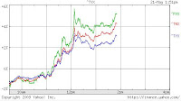
This is an intra-day chart comparing 5-year Treasury yield (^FVX), 10-year (^TNX), and 30-year (^TYX).

Standard & Poor downgraded the outlook on the United Kingdom from "stable" to "negative", and is threatening to downgrade UK 's credit rating (currently, surprisingly still AAA). Fear of "Will the US be next" is probably weighing on the stock market and the bond market (yes it is, says PIMCO's Bill Gross). Japan's credit rating is already cut from AAA.

Dow Jones Industrial is currently down 190, over 2%.

Things seems to be getting unhinged, again. (Mercury Retrograde in full force.)

Wednesday, May 20, 2009

Put/Call Ratio in a New Channel?

Upfront, I must say I don't know enough about this indicator, I don't use them regularly (it is considered a secondary indicator). I'm no TA expert and I don't even know the regular TA applies to this indicator. But the recent decline of VIX below 30 piqued my interest.

This is a weekly chart of CBOE Options Total Put/Call Ratio Index, over 3-year period. Put/Call Ratio is a gauge for market sentiment, and considered a contra-indicator. If the ratio is too low it is considered to be signaling over-bullishness and imminent market turn. If it gets too high it is considered bullish. It usually spikes up in market fear/panic.

Looking at the chart, however, I noticed that the March low happened when the ratio was trending down. After the low, the ratio kept going down.

I eyeballed the range for the most part of 3-year period between the green lines. The range between the blue lines is my eyeballing of the trend since last October, when the market started to crash in earnest. It's a down-trending channel to me, if that's possible. Could it be because of the popularity of leveraged ETFs, and investors don't use options as much these days? (Therefore the ratio doesn't give a meaningful enough signal?)

So I put 4 charts just showing the weekly volume of popular leveraged ETFs below the Put/Call Ratio chart: from the top, they are SKF (double short financials), UYG (double long financials), FAZ (triple short financials), and FAS (triple long financials). I picked financial ETFs, as the main cause of the severe market decline has been attributed to financial stocks. The down-trending Put/Call Ratio does seem to correspond to markedly increased volume on these leveraged ETFs.

It's also entirely possible that it is basing, and getting ready for a spike up.

Dow Jones Industrial Intraday

(1:05pm PST Update)

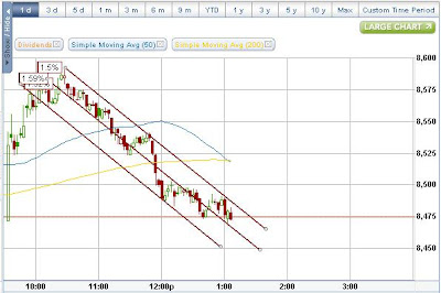
Haven't seen that kind of sell-off for some time. The final hour was nothing but selling, which drove Dow from 8,521 all the way down to 8,406 (ended off the low). So far, I can't find any news that could have triggered this. Today's point swing is 185 pts from the top to the bottom. It must have taken out lots of stops...

Trading volume was higher than yesterday. Another bad sign for market bulls.
-------------------------------------------------
(11:36am PST Update)
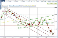
Now the channel has changed to a slight upward one, with a few burst of severe sellings as you can see in this 3 minute chart.

It sort of feels like a topping action...


--------------------------------------------------
Dow Jones Industrial Average is trading within a severe downward channel for more than 2 hours, ever since, I was told, the Q&A started in today's Senate Hearing and the Treasury Secretary started to fumble for words (I don't know that, I wasn't watching, I'm just reporting what I heard). (Ignore the percentage tags on the chart. I can't get rid of them..)


Some numbers to watch:
  • On a daily chart, the mid Bollinger band is somewhere near 8,310 so there's still some way to go if the index is to correct to that point.

  • May high for the index is 8,588.

  • May low is 8,230.

  • And that May low is not very far from February high (8,312) before it all started to crater.

  • Simple 50-DMA is about 8,000. I would start to worry if it starts to threaten this line.

Tuesday, May 19, 2009

General Market Analysis

Here's the link to market analysis from guys at breakpointtrades.com. The link goes to a page with a whole lot of charts and MP3 audio file. I started subscribing to their newsletter in February. (Newsletter subscription is free.) They've been spot on, as far as I've listened to them.


Here are two long-term charts from them, which you don't get to see very often anywhere else. They are monthly and weekly charts of S&P 500 index. They've given me some peace of mind as well as better outlook on the market.


10-Year Treasury Note Yield

The chart looks very bullish, and that's what you exactly DO NOT want, particularly if you are a Fed official. It means the yield may go a lot higher, which will make the interest rates on mortgage loans much higher.

The chart plots the YIELD (not price, which moves inverse to the yield) of 10-year Treasury note (TNX). It is a weekly chart to elminate daily noise. As you can see, it is above both EMAs and is poised to go higher. RSI doesn't have much more wiggle room; it will either break up the descending trend line from 2007, or break down the support line from December 08 low.

If you further eliminate the noise and look at the Point and Figure chart of TNX, it shows the target at 50. The target price of a P&F chart doesn't always happen (the reverse signal will be given if TNX goes down below 30), but the prospect of having 5.5% yield on 10-year note in this economic condition is certainly not what the government would want.

The Fed's quantitative easing started on December 08, and the effect lasted until January 09. Not much of an effect, I would say, but the Fed claims that the yield would be much higher without their intervention. Maybe.

Monday, May 18, 2009

Unleveraged short ETF Does Not Perform, Either

SEF is Proshare Short Financials, an unleveraged short ETF. Having examined the performance of leveraged (2x, 3x) short and long ETFs, I thought, maybe an unleveraged short ETF would be the way to go when the market turns south again, because it was the leverage that exercebated the volatility decay.

Wrong again. Take a look at the chart below. It compares SEF and XLF (unleveraged Financial Sector SPDR ETF) for the same 6 months. The green line is at 0% change. XLF is back to the same level, an SEF is down almost 40%. If I connect the points where two lines intersect (the black line on the chart), the symmetry does exist on the either side of this declining line.


From the looks of it, even if XLF were to correct 50% from here, SEF would only go up to about November 08 level, at best.

I like GS better than BAC

(Update 2:28pm PST) According to Bloomberg, Goldman Sachs, Morgan Stanley and JP Morgan Chase applied to repay the TARP money.
GS was up 6.5% for the day, MS up 8.2%, JPM up 6.7%. XLF was up 6.5%.
----------------------------------------------------------------

Goldman Sachs (GS) upgraded Bank of America (BAC) from nutral to buy, and put the stock on their "Conviction Buy" list today.

BAC has been on my "Shoulda, Coulda Stock" list, but actually I like GS better. Much better. It is probably too late to buy, and if it is not too late the easy trade is probably over. This is one of the stocks which traders have kept saying will collapse at any moment ever since it hit the low in November 08 and started climbing up.

This is a weekly chart of GS, to get the daily noise out. From December 08 to mid March 09, the stock spent time going up and down the ascending channel, which many people called a bearish wedge (which will normally break to the existing trend: down). Then it broke out of the wedge to the UPSIDE (this was probably a safer point of entry with stop at the trend line), and since then the upper trend line hasn't been breached. Ahh nice hindsight. Always 20/20.

Not only that, the stock is approaching the trend line (around $140) that connects March 08 low, September 08 gap, and May 09 high. On the weekly chart, the shape from September 08 to present could be a cup - a handle may form.

The only thing I don't like is the volume, which hasn't picked up much on the ascent. On the bigger picture level, it is hard to buy and hold any financial stock for the fundamental reasons. But technically, it is what it is: looking good.

Sunday, May 17, 2009

Case for Sucker's Rally to Continue

The market move from March 6 low (of S&P500 at 666, no less) has been called by many people as "a sucker's rally". You can read all about it here, here, and here. (The links will open a new window.)

In fact, as the links above will show you, they've been saying this is "a sucker's rally" from right after the March 6 reversal (the first article above is dated March 11) all the way up to last week in May. And now that the indices has had their first significant down week for the first time since March low, everyone seems to be saying "See, I told you it was a sucker's rally. Now it's over (about time) and we will head down big and take out the March low."

Let's see, a contrarian in me has almost an reptilian response to such a sentiment. Mind you, I am in no way a perma-bull like certain people you see on TV. Talk of "green shoot" simply creeps me out. (It almost feels like an insult to the reality.) I think we are in for a deep recession, which is NECESSARY in order to purge the misallocated, excess resources from the system. However, that's fundamentally speaking. The technical picture, I think, is different, and I'm not fully convinced that this "sucker's rally" is over.


This is a Dow Jones Industrial Average weekly chart going back to June 2006. 13-EMA and 34-EMA are pretty good indicators on changeover from a bull market to a bear market. 13-EMA crossed 34-EMA downward in December 07, signaling the start of a bear market. 13-EMA has been under 34-EMA ever since. Only twice 13-EMA has turned upward approaching 34-EMA; one was May 2008, the other is right now, since March.

RSI also has broken above the down trend line all the way back from May 07, first time ever since the market topped in October 2007.

The blue and green horizontal lines are Fibonacci retracement lines: Blue from the market top in 07 to the March 09 low; green from the October 08 high to the March 09 low.

The current "sucker's rally" has taken the Dow to 38.2% retracement from the March 09 low to October 08 high (Green Fib). So it is technically a good place to turn back. But I'm just wondering how many "suckers" have jumped in the market.

The V-shape reversal, I think, is more like a reptilian brain reaction to the preceding 4 weeks' steep decline. Then, for almost the entire month of April the market spent the time going sideways, slightly up but not like the V reversal days. All the while traders, analysts were warning it would collapse any day. Which it didn't.

To be really a "sucker's rally", the rally has to threaten to fill the huge gap down created in October 08. Right now, it is nowhere near it. The good place on the chart to achieve that goal seems to be 38.2% retracement from the bottom on Blue Fib, which pretty much coincides with 61.8% retracement from the bottom on Green Fib. That's about 9300-9400. At least Dow should go above 9000 to really sucker in the retail investors.

I do think it is quite possible that the November 08 low will be revisited, but for the market to crash down from here, I'm not sure. The larger weekly volume on an up-week compared to a down-week also speaks of support.

Now it seems most people who went short in April have covered. Given the uncertainty on so many economic and political fronts, it is quite possible, even probable, that the market will do what everyone says it will do: go down big, and I will probably eat my crow. (Besides, it's Mercury Retrograde time.) But in case it doesn't, you've read about that possibility in this post.

Friday, May 15, 2009

Leveraged Long ETFs May Not Be What You Think, Either

Danger of leveraged short ETFs has been discussed in this post, but here's more. The focus is on financial LONG ETFs.

XLF is un-leveraged, UYG is double long, FAS is triple long. Looking at their charts, you wouldn't be able to tell that, would you? XLF is almost back to the December level, while UYG is about half that, and FAS is about 1/3.

UYG has more than doubled since March low, and FAS more than tripled while XLF is slightly less than doubled. So if you were able to pick that bottom, good for you, you have bagged the huge gain. On the other hand, if you have been holding XLF since the beginning of the year and didn't sell into the dump in March, you are back to where you started. The same cannot be said for UYG and FAS.

Here's another set of charts, comparing FAS (triple long) and FAZ (triple short). Visually, in the bigger scheme of things, they both seem to be flat-lining. There are enough daily fluctuations for trades, but I'm now more convinced that they are indeed for short-term trades only.

Thursday, May 14, 2009

What's With The Hartford (HIG) Today?

-----------------------------------
(Update 4:45pm PST): The Hartford Receives Preliminary Approval For $3.4 Billion Participation In Treasury's Capital Purchase Program. The stock is up 6% in after hours trading.
-----------------------------------

Hartford Financial Services Group, or The Hartford as is usually known, is up 20%. I don't know anything about the stock (other than it's in one of the most troubled sectors - insurance), I don't know any news that's moving this stock (rumor is that it may be being acquired, but they say that all the time, don't they?).


The chart, though, if you do not know it is an insurance company, looks interesting. Not the daily chart but weekly chart.

Possibly a double bottom formation, RSI above the descending trend line from October 2007 AND close to 50 (it popped above 50 last week), money flow may be (just maybe) turning positive.

It can be a contrarian trade (i.e. go where everyone says don't go), if you are willing to risk your money. FYI, someone bought close to 6000 call options on HIG today, September $25 strike. That's good $10 away from the current price. Half a million dollar worth of money. The existing open interest was 669 as of yesterday. Interesting.

S&P 500 Symmetry - Careful What You Wish For

Just last Friday as I was looking at the 1-year daily chart of S&P 500 Index, I thought: With the March 6, 2009 low as a head, the chart looks like a seagull in flight. At first I was looking only at about 2 months wing-span, one-month for each wing. Then I looked at 4 months span, and the symmetry still continued. Well, if this symmetry continues, the index should come back down to 875-880 area.

Well it did, almost. With yesterday's close, the index retreated to 883, and some kind of bump back to the trend line was created, just like the one back in early January.


If the symmetry goes further, this bird will start to look more like a bald eagle with its wing tips pointing downward. That means S&P will revisit November 08 low of 741 in about 4 to 6 weeks. I don't quite relish the prospect, but that will put a significant higher low on the index IF it stops there. (It may simply crash through it, instead of turning up.)

Wednesday, May 13, 2009

Bad Retail Numbers and Men's Warehouse (and Maidenform)


----------------
Update (12:35pm PST): I've found the equivalent in women's apparel! Maidenform Brands (MFB) who sells women's bras and panties, up 5% for the day ... Go figure (literally...).
-----------------

So the Commerce Department released the April retail sales numbers that were worse than economists predicted. This week, bad news gets sold, not bought like in the past several weeks.

So I opened the panel that I track retail stocks, and in the sea of red I found a stock that's going up over 8% in the terrible tape. Men's Warehouse (MW).

Huh?

Then I remembered seeing a strange CPI (Consumer Price Index) data about men's apparel, so I dug that up. Here it is (source: US Bureau of Labor Statistics):

In 3 months ended in March 2009,

  • Men's apparel went up 23.2% in seasonally adjusted annual percentage.

Within men's apparel category (in seasonally adjusted annual percentage),

  • Men's suits and coats went up only 1.2%; but
  • Men's furnishings (ties, cuff-links, tie pins, leather wallets, etc) went up 21.1%;
  • Men's shirts and sweaters went up 35.1%;
  • Men's pants and shorts went up 31.8%.

And these are US urban dwellers average. For urban wage earners, these percentages are higher.

So Men's Warehouse may not have made much money on suits and coats, but must have done a good business on shirts, sweaters, and pants.

By all accounts we are in a severe recession (some already calling depression). So I suppose men are dressing up like in the 1930s...

Tuesday, May 12, 2009

Time To Say Goodbye To My GOOG Holding?

I have a minute position in Google (GOOG) since around $360. I haven't paid much attention other than check the price and volume now and then.

What has bothered me about the stock during the entire run from the March low is low volume. Except the huge spike over the earnings report, the volume is ever decreasing. I've heard it said that a stock can go up on a low volume after it bottomed, because stronger hands hold it now. But I'm not so sure.

I have had a distinct feeling that big traders have been using Nasdaq beta stocks (GOOG, AAPL, AMZN, RIMM, etc.) as ATM to fund their longs or shorts in financials.

The stock recently hit $412 on a very low volume and turned back. That price level was where the support was in 2008. It would have been a great long-term short from May 2008 high, but I think I will step aside for now and see how it behaves around $400 - 412.

Will GDX Break Resistance At $38-39?

GDX, Market Vectors Gold Miners ETF, has been hitting the head against this price barrier ($38-39) since last August. It is trading at $38.70 right now, up $1.39 from yesterday.

The attempt to go above $39 is the 5th one since last August when the initial drop occurred. It is the third since the deep correction in October that took the ETF down to $15.83 (that was a buy if you were really brave, and hindsight is 20-20, and fish was big, and...); since then it is making higher lows and higher highs, but has retreated at around $38.

The ETF was created in May 2006 so there's not much there to check historical trends, but the stock spent the first year and a half oscillating between $33 and $43.

I have a very small position in GDX, which I bought at $33 and which I was planning on selling at the longer-term top range of $43. I'll see if it can muster strength to go past $39 this time.

Monday, May 11, 2009

Green Mountain Coffee Roasters (GMCR)


This one has been vaguely on the edge of my consciousness, so it's not a "Shoulda, Coulda stock" but a completely missed trade.

All I know about Green Mountain Coffee Roasters Inc. (GMCR) is that it is the sole supplier to McDonald's. The stock's low was back in November, and ever since then it has been making higher lows and higher highs despite the worsening overall stock market.
It was in a channel as you can see in the chart, from November to March. In April, it broke out of the channel, then back-tested the upper channel line, and then off to the races on the earning report.

The stock looks extremely extended for now, but coffee futures are spiking up due to supply concerns. It will be interesting to see if the gap gets filled.

Sunday, May 10, 2009

What This Week May Bring To the Market

Lacking an omniscient crystal ball, I rely on technical analysis (TA) while keeping the bigger macro picture in mind (at least I try to). To supplement my elementary TA skills, I regularly go to several sites on the Internet, and I want to share two of them here.

First one is Tape Talk at Tickerville.com. The link below is the latest Talk available to the general Internet public, in which Q-man, a.k.a. Quint Tatro, discusses the general indices and sectors he's been watching. (They have another set of videos for their paid subscribers.)
  • Bullish Until its Not
    "The bulls were not going to give up easily Friday as they worked hard to regain just about all that was lost in the S&P during Thursday’s slide. The NASDAQ didn’t have as bullish a showing but what do we make of the underlying sectors? "

His analysis mostly uses trend lines and price/volume action, clean and simple. I participated in his online Boot Camp of stock analysis last year.

Second one is from a paid site, breakpointtrades.com. They have a free newsletter that you can subscribe to, which is a very, very detailed discussion of major indices by By Steve Nelson & Matthew Frailey. They use all sorts of TA tools - trend lines, price/volume, Elliot Waves, Fibonacci retracement numbers, RSI, MACD, etc. What I find it extremely useful is their long-term charts with parameters (EMA, Stochastic, MACD) set to clearly show when the bull market ended and where we may be heading. The link below is the latest Newsletter.

They say an interesting thing which is worth highlighting: the last year's high was in May, right in the option expiration week. Will the history repeat itself? We'll see soon enough, but from their analysis the S&P 500 index seems to be fast approaching some critical resistance levels in various parameters. As is, the index is extended.

Saturday, May 9, 2009

Pitfalls of Ultrashort ETFs

Boy have I learned that thoroughly! Take a look at these charts. They are Ultrashort ETFs that are supposed to replicate 200% inverse (double short) of the performance of the underlying indices. They have been quite popular among both retail investors and professional traders since the October/November Cascading Waterfall Crash of 2008, but some pundits (most vocal being Jim Cramer of Mad Money fame) are increasingly critical of this type of ETFs, blaming them for the terrible market we have had since October.

Below are the charts of the popular (and once popular) double short ETFs.
FXP: Ultrashort FTSE/Xinhua China 25 (high: $183.99, 5/8: $15.20)
EEV: Ultrashort Emerging Markets (high: $207.10, 5/8: $23.52)
SRS: Ultrashort Real Estate (high: $295.72, 5/8: $19.78)
SKF: Ultrashort Financial (high: $303.82, 5/8: $38.94)
SDS: Ultrashort S&P 500 (high: $133.20, 5/8: 56.03)
QID: Ultrashort QQQQ (high: $102.60, 5/8: $37.20)

and to compare that with the general market,
SPY: (long) S&P 500 (9/2: $127.99, 5/8: $92.98)
VIX: CBOE Volatility Index (9/2: 21.99, high: 80.86 (December), 5/8: 32.05)


Despite the market turmoil, the first to whimp out was FXP, as Shanghai Index bottomed in early November. Next in line was EEV, emerging markets double short. Then SRS, commercial real estate double short, even though CRE is every analyst's favorite "next shoe". SKF, financial double short, performed well enough until recently, then went from $250 to $39 in 8 weeks. SDS, double short of S&P 500 index, and QID, double short of Nasdaq, appear to be in better shape than their peers, but compare them to SPY. Despite the recent run, SPY is nowhere near the level of last September (it is down 27%). Yet, SDS and QID are barely hanging on to the unchanged level.

Why this happens is in the very method that these ultrashort ETFs are created. They are meant to follow the daily performance of the underlying indices. Keyword here is DAILY. For more on this, read here, and here.

If you didn't know this and held these ETFs as an investment, instead of profiting from the market turmoil you would end up with less money, far less. In order for these short ETFs to work, you need 1) high/increasing volatility; 2)for that volatility to sustain and go up further for some period. Even in such volatile period, if you are not quick enough, you end up losing all the nice fat gains. Take another look at the charts. See the huge spike in prices in October-November period? During that period, these short ETFs acted like OPTIONS. And I think that is what they are: options, without expiration date.


Here's one example of rather absurd outcome: SKF (blue line) vs IYF (red line, long financials ETF, no leverage). Since September last year, IYF has lost 43%. SKF has lost 63%.

The winning trade, therefore, was to short BOTH.

Double long, or triple long ETFs do not seem to decay as much, though they often "underperform" single ETFs.

So, the lessons learned for me with ultrashort ETFs and triple short ETFs are:
1. Use them only when we have a sustained period of down market. Or day trade. (You really can't beat the thrill of seeing FAZ (triple short financials) go up 25% in a few hours... Oh I talk like a gambling addict, don't I?)

2. It is better to short the long ETFs or underlying stocks, or buy puts (in case of IRA accounts) if you are going to hold short positions for a sustained period of time.

I have traded SDS, SKF (double shorts), SSO (double long), and FAZ (triple short). Miraculously in retrospect, I made money on all of them except SSO (which I got out about even) without quite understanding how these ultrashort ETF behave. Luckily for me, the market was in a severe, sustained downturn.

I still have FAZ, my third purchase, that I'm stuck with. At this point, the share price got so ridiculously low (FAZ went from recent high of $104.07 on March 6 to May 8's $4.49: mind-boggling 96% down in 2 months) I'm keeping it as an amusement to see how low it will go. It will probably go at least as low as FAS, its triple long counterpart, went: $2.64. All the loss on FAZ has been more than made up by hansome gains by FAS. If this rally continues, FAZ will go to ultrashort ETF money heaven. If the bears return in vengeance, my single-digit FAZ can go up 1000% in a few days...

Friday, May 8, 2009

FITB Goes Vertical

Fifth Third Bancorp (FITB)'s share has gone vertical, and is up 56% at $8.43 for the day right now (11:10am PST). The bank was told yesterday to raise $1.1 billion, and the stock went up after hours to $6.40.


Where is "Sell the News" crowd?

Thursday, May 7, 2009

MTL, for a change


I'm having a burnout, exhaustion from all these financial "stress test" result leaks and the actual anticlimactic results themselves, so I decided to take a look at my most successful holding of past 2 months. It's a commodity stock, a Russian iron ore/coal/steel company Mechel Steel Group OAO (MTL).

Look at the weekly chart. This stock had a great run from October 06 to June 08. I had this stock from $45 to $55, sold it, and watched the spectacular crash from the sideline as far as this stock was concerned. It was not just commodity crash; there were allegations of price fixing, and after Mr. Putin wished the MTL president "well" after the president couldn't attend the government meeting for "health reasons", the stock really crashed.

I kept watching. Then in the miserable market I started to notice positive divergence popping up one after another. They are all noted on the weekly chart. And when the March market low didn't affect MTL and other Russian stocks I was watching (RSX, VIP), I decided to wade in. It was part of the hedge against inflation (commodity play), and a contrarian play. Among BRIC countries, investors and traders seemed to have turned away from Russia, ignored India while they still favored China and Brazil. I have no feel for India, so Russia would be my play.

It has turned out great, so far. Up over 80% from my first purchase, with average price of $4. This stock is very unpredictable if you look at it daily. A strong volume sell or buy appears seemingly out of nowhere, on no news. But if I look at the longer-term weekly chart, I do like what I see. 13-EMA may be on its way to crossing 34-EMA, a sign that the stock may be entering the bullish phase again. So I'm letting it run, nervously. From the daily chart, it could come back down to $5.50 to $6.

30-Year Treasury Intraday Chart

Apparently, Rick Santelli of CNBC remarked "Put a tail on it and call it Lassie" right after the auction result was in. Since then, the tail has gotten longer, flowing in the wind.

FAS Looks Pretty Good, If You Just Look At It


and don't think about the underlying sector or about the imminent disclosure of bank "stress test" results.

FAS is the ticker symbol for the ETF that tries to replicate 300% of the daily performance of the Russell 1000 Financial Services Index. It is a relatively new ETF (launched last November, in the middle of the crash, as you can see on the chart), but it is increasingly popular particularly since the March low, with the financial sector perceived to have hit the bottom for some time.

I'm in this stock for several weeks, small position, bought in stages. My average is somewhere mid $6. They say double and triple ETF, long or inverse, are just for day trading and not for investment, but I somehow ended up with "investment".

These stocks, double or triple, swings wildly and are decidedly not for the faint of heart. They act more like options, except they don't expire.

I didn't bother to even check the chart when I first bought it in mid March as a partial hedge against FAZ, which is the inverse of FAS (so FAZ is triple short).

Now that FAZ is a miniscule hedge against FAS, I finally bothered to check the chart. And I'm happy with what I see. Too bad the government has to publish the stress test results today (5:00pm EST, I heard).

Wednesday, May 6, 2009

It's a Melt-Up? Or Will It Melt-Down?


Ding ding ding...UPDATE: It was Melt-Up for today.

(2:00pm) Well, that was quite a ride in the final hour. Almost right on cue, sellers came in and brought the index down to 8440 area, only to have it melt up again and over 8500 mark in the last 3 minutes.
I didn't get out of any of my long positions. (Not that I wanted that way, necessarily, but the limit order didn't fill.) I'm so still letting them ride, one nervous day at a time. (OK, WFC sale was a panic. I got scared seeing the upside.)
---------------------------------------

(11:40am) In the face of uncertainty on just about anything. My pain today so far comes from not having covered my FAS calls that I wrote. It also hurts to see Wells Fargo (WFC) continue to go up.

Here's the intra-day 5-minute Dow Jones Index today. It may crash by the close, which is 1 hour and 40 minutes away, but looks strong so far.

Traders will probably exit their positions in financial stocks before tomorrow's stress test results, but nothing seems certain anymore these days.

But I can say this: in the past 4, 5 weeks as the market cautiously climbs up, technical analysis on stocks on the long side have started to work almost for the first time for me in a long time. Probably since May of last year.

Tuesday, May 5, 2009

Is Transport Leading the Rally, or Not?

Performance of the transportation sector is considered to be a leading indicator for the general market. It falls before the general market, and it bottoms before the general market, or so I have heard from analysts and chartists. So how is the sector performing in the current rally we're having since March low?

The chart plots two railroad companies, CSX (CSX) and Norfolk Southern (NSC), against two trucking companies, Federal Express (FDX) and UPS (UPS). The yellow line is S&P 500 Index.

One thing I noticed right away is that the transport bottomed on the same day as the market. It is not leading. At best, the performance of the trucking companies are in-line with the market advance. Also, trucking companies are outperforming the railroad companies, which still lag the market. So what is that telling?

Let me hazard a guess. Whatever glimmer of recovery that some experts are saying we are having, is indeed consumer led. Need for consumable goods are there, and maybe increasing. But demand for industrial raw materials that require railroad (crushed stones, wood and lumber) has not substantively increased.

I am not in any transport stock (I don't know them enough), but I'm watching, as one of the indicators for the general market. One good thing I can say about the sector is it is rising with the market. I would worry otherwise.

Both FDX and UPS are up for the day.

Having Seller's Remorse on Wells Fargo...

So the government regulators supposedly have told Wells Fargo (WFC) that the bank need to raise new capital, according to various news sources, and the stock jumps 23%.

I've been long WFC since late March when the stock was $15. Today, as I was watching the stock just keep going up and up, what I felt was not joy but fear. Now what? My head went blank. It has been stomach-churning 5 weeks of holding this stock, even though it dipped below my buy price for only three days (right after I bought it... that was bad). Candlesticks on the daily chart for the past 4 weeks are almost exclusively "hangman" or "hammer", and they looked like they would fall off for no reason at all. So all I could think was SELL. And so I did.

There were actually technical and non-technical reasons why I bought that stock to begin with. Technical: It popped through 50-DMA on daily, and came back down to it on a lower volume. Non-technical: 1) Banks were vilified, shorted heavily. Short side at that point looked too crowded; 2) local WFC branch people were always nice and helpful, unlike local BAC.

So, after I sold, I immediately got the seller's remorse. Too late. Partly to justify my sale, I took a look at the longer-term weekly chart, and I'm pretty happy with my panick decision. While I do think there may be still a momentum left (weekly RSI still barely above 50), the stock just hit weekly 50-MA (daily hitting 200-DMA) and seems to be entering the very jagged overhead from October 2008. It is possible that the stock can clear that and hit the all time high, but the next $8 may be harder to come by than the $8 that I just bagged. So I'll move on, for now.