Friday, July 30, 2010
Well, Hello Fractals.... Dow 3-Year Chart Now and Then (2008, 2009)
Nothing to trade here, so I started my game of pattern recognition in the 3-year Dow daily chart. And I'm seeing something interesting. I'm not claiming it definitely, but I'm just sharing.
I see a pattern from October 2008 to June 2009 being repeated, albeit on a smaller scale and shorter time frame: diminution.
We know what happened after April 2009. It seems like QE2 in some form is all but guaranteed. Are we going to have another melt-up on low volume, going into the November election?
But you may also notice that the current pattern looks very similar to the pattern right after the market top, from December 2007 to April 2008. We know what happened after that. The stock market went up in April and May, making TA people giddy with the idea that the chart is forming a big "cup and handle" pattern and that the upside would be so great when that pattern breaks to the upside. And then June came, and it was all downhill from there...
So, take your pick. Or don't pick at all and join people who have been yanking their money from the equity mutual funds.
The Cardinal Climax is coming. Just so you know.
Thursday, July 29, 2010
CBOE's Weeklys on ETFs and Stocks May Be Causing a Range-Bound Market Since June?
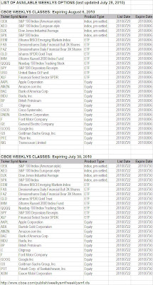
If you trade any of these ETFs and stocks, be aware that they have weekly options (Weeklys) traded on them on top of regular options, courtesy of CBOE (Chicago Board of Options Exchange), that expire every Friday. In case you're wondering why Apple (AAPL) gets hit back to $260 for several weeks, this may be your answer. CBOE has had Weeklys on the indices (S&P 500 and Dow, both American style and European style) since 2005, but the introduction of Weeklys on ETFs and select stocks is a recent event (since June 4, 2010).
ETFs:
SPY (since June 4, 2010)
QQQQ (since June 4, 2010)
DIA (since June 4, 2010)
IWM (since June 4, 2010)
EEM (since July 5, 2010)
USO (since July 5, 2010)
GLD (since July 5, 2010)
XLF (since July 5, 2010)
Stocks:
AAPL (Apple; since June 25, 2010)
BAC (Bank of America; since June 25, 2010)
BP (BP; since June 25, 2010)
C (Citigroup; since June 25, 2010)
F (Ford; since July 5, 2010)
GOOG (Google; since July 5, 2010)
What's more, the individual stocks that will have Weeklys on them seem to vary from week to week. Here's the latest indices, ETFs, and stocks that have Weeklys (table downloaded from CBOE):
(Click on the chart for a better view. If the image doesn't load fast enough, go here and download: http://www.cboe.com/publish/weelkysmf/weeklysmf.xls)
Note to FAS/FAZ traders: They've been range-bound for a reason...
Tuesday, July 27, 2010
Amazon Runs Out of Kindles
-------------------------------
so reports Barron's Tech Trader Daily by Eric Savitz on July 27, 2010. Maybe that's why the stock had a miraculous reversal the day after the earning announcement:
(Quote)
Amazon.com (AMZN) has temporarily run out of Kindles.
Here’s what it says if you attempt to buy the e-Book reader on the company’s Web site:
“Temporarily out of stock. Order now and we’ll deliver when available. We’ll e-mail you with an estimated delivery date as soon as we have more information. Your account will only be charged when we ship the item.”
And what do you see when you go to the Amazon home page? Why, a promo for the extra-big Kindle DX!
As SlashGear notes, the sudden Kindle shortage could mean there has been a surge in demand - or it could mean a next-gen Kindle is on the way.
(Unquote)
That sudden reversal after the earning report has kept my AMZN puts worthless, but I still don't think much of the AMZN chart. Ever since the July top of $124.88 it's on the decline, underperforming the index (Nasdaq). You could say it is resilient, refusing to sell off. But it looks to me like it wants to sell off at any time now. (Of course I'm biased, I have AMZN puts.)
This stock and another Nasdaq beta Research in Motion (RIMM) look to me to be ready to dump. But then the Kindle rumor may be true, and RIMM just announced the iPhone "killer". They may turn on the dime.
Monday, July 26, 2010
AAPL's Peculiar Candlestick Pattern
----------------------------------------
Apple (AAPL) is forming an interesting candlestick pattern. I think it is either "Falling Three Method" or "Rising Three Method". I know I know they are total opposite, but I can't decide. So I let you see the chart.
Here's AAPL's 5-month daily chart. Since late April, the stock hasn't gone anywhere. Except for the flash crash on May 6, it has been range-bound. That itself is interesting, as this is one of the most favorite stocks of algo bots - big cap, high volume, high beta.
Here's the explanation of "Falling Three Method" from Stockcharts.com's Chart School Candlestick Pattern Dictionary:
A bearish continuation pattern. A long black body is followed by three small body days, each fully contained within the range of the high and low of the first day. The fifth day closes at a new low.
And "Rising Three Method":
A bullish continuation pattern in which a long white body is followed by three small body days, each fully contained within the range of the high and low of the first day. The fifth day closes at a new high.
The problem I have in determining the pattern is that the first day (Wednesday last week) was an up day but it was a gap up and sold off all day with the market. That doesn't feel bullish. But then, either pattern is a continuation pattern, and Tuesday was a huge up day.
So, cautiously, I am inclined to say it may be a "Rising Three Method" pattern, which means AAPL will go up tomorrow.
The stock futures are currently down. TA people are calling for a "consolidation" after three consecutive up days.
Well, the major indices registered a pattern called "Three White Soldiers", which is a bullish reversal pattern.
There was a sizeable volume (13,494) on AAPL August $280 call option (OE 36,273).
But the algo bots will do whatever they want to do, and the market can melt up or down on a thin summer volume. GLTA.
Tuesday, July 20, 2010
Large Caps on Turnaround Tuesday Look the Same
Here are the 6-month daily charts for (from the top):
Las Vegas Sand (LVS)
Nucor (NUE)
Google (GOOG)
Freeport-McMoran (FCX)
J.P.Morgan Chase (JPM)
Don't know what to make of them at this point, other than my guess that algo-bots are simply working the ETFs and index futures so the heavily traded large caps all move the same way regardless of industry or fundamentals.
But even with today's move, these stocks, with the exception of LVS, are either still below 50-DMA or barely touching, or crossing 50-DMA but 200-DMA is still far away. It will take a lot more consolidation to repair the damage.
I personally like LVS (not on the 6-month chart but on the longer charts like 3-year). It was a steal at $1.30 or so in early 2009. It could go up the thin vertical wall that was October 2008 and reach $30. I just don't know when or how. (Casinos in Singapore and Macau, maybe.)
"Turnaround Tuesday" delivered a turnaround. Let's see if they (bots and bots operators) intend to hold it. The Fed chairman Ben S. Bernanke will be testifying in the Congress on Wednesday and Thursday. It could affect the stock market.
Tuesday, July 13, 2010
FAS - Mind the Gap
As algo bots busily and dutifully working every microsecond of the day (and night) with the self-sameness, the humans that still inhabit the financial media outlets are doing their best to craft a narrative depending on the market direction of the day (sometimes of the hour), which has little to do with the reality on Main Street.
Since these bots like beta and leverage, IF they are planning to ramp up the market even further (until the Cardinal Climax hits), what better tool to hitch that ride than a triple-long ETF?
Here's a daily 9 month chart of FAS, triple-long financial ETF. The candlestick chart looks like a crap, full of gaps. Who in the sane mind wants to trade this? Or for that matter, any stock in this market?
Since the bots seems to like Fibonacci retracement numbers, I put in two sets of Fibs: one from May high to July low, the other from April high to July low. Today, it passed the 38.2% retracement to May high.
The biggest gaping gap exists between 50% and 61.8% retracement to April high. If this gap is filled, FAS will be about $31. It closed today at $23.57.
Now, is there any hint on the technical indicators that supports this bullish scenario? In fact there is. More than one. First is MACD. Notice the positive divergence developing. The second is ultra-slow stochastics (89), which just crossed above 20. If this stays above 20, it may be a buy signal.
The buy signal may be short-lived, though. J.P.Morgan Chase (JPM) will report its earnings during Thursday premarket, Bank of America (BAC) and Citigroup (C) during Friday premarket. In previous two earnings, JPM was sold hard despite beating the estimates.
If you got FAS, maybe it's safe to sell tomorrow and avoid the heart attack waiting for JPM to report on Thursday morning.
Oh I forgot. Fundamentals don't matter.
Algo bots have their own minds. As I wrote on the chart, if the chart is somehow plotted in 3D with data that is not represented in this 2D chart (data like each individual trade size and price done by the bots), it may become a beautiful Lorenz attractor and it may all make sense.
Sunday, July 4, 2010
S&P 500: Another Death Cross Imminent?
The index is about to have another death cross on the weekly chart. On the weekly chart, I look at two Exponential Moving Averages (13-EMA and 35-EMA) to see whether they are crossing, or 40-week Simple Moving Average to see if the index crosses below it.
Here's 3-year weekly chart of S&P. 13-EMA and 35-EMA is about to cross: less than 3 point. As you can see, 13-EMA crossing below 35-EMA in December 2007 was a pretty good indicator of a major directional change of the market. 13-EMA stayed below 35-EMA all the way till July 2009. 13-EMA/35-EMA pair does not call the market bottom, but rather it seems to indicate the safer point to go long, as in July 2009. Now 13-EMA may be crossing down again for the first time since December 2007.
I also use 40-week Simple Moving Average on weekly. As you can see, this one spotted the turn in the market a few weeks earlier than 13-EMA/35-EMA cross. Week before last, the index decidedly broke below 40-MA, and it couldn't regain that line this week.
End of the "bull market", as many pundits and analysts are saying?
I don't think so. I'm in the Peter Schiff's camp in thinking that this has been a Federal Reserve and government stimulus-induced counter-trend bull run within the bear market and the run is now ending. Elliott Wavers would say P3 has finally arrived. (The only problem is that they have been calling P3 at every downturn in the market since March 2009.)
Some technical indicators, which, along with 13-EMA/35-EMA cross, I picked up from BreakPointTrades.com guys, also show that the market was never in a bull market. They are all flashing a sell signal. Slow stochastics set at really, really slow (144) shows that the indicator never went to oversold territory in the whole "bull run" from March 2009. Notice that at the market top in October 2007 it was in the oversold territory of above 80.
CCI set at 133 also shows that the market was not in a bull market (above 100). It went nowhere remotely near 100 since March 09. In a bull market, this indicator stays mostly above 100.
Along with another long-term indicator NYSE Summation Index (Cumulative) that also turned bearish in late May, these special technical indicators and moving averages give me some sense of peace of mind, knowing that the things are about to get dicey...
Be safe.